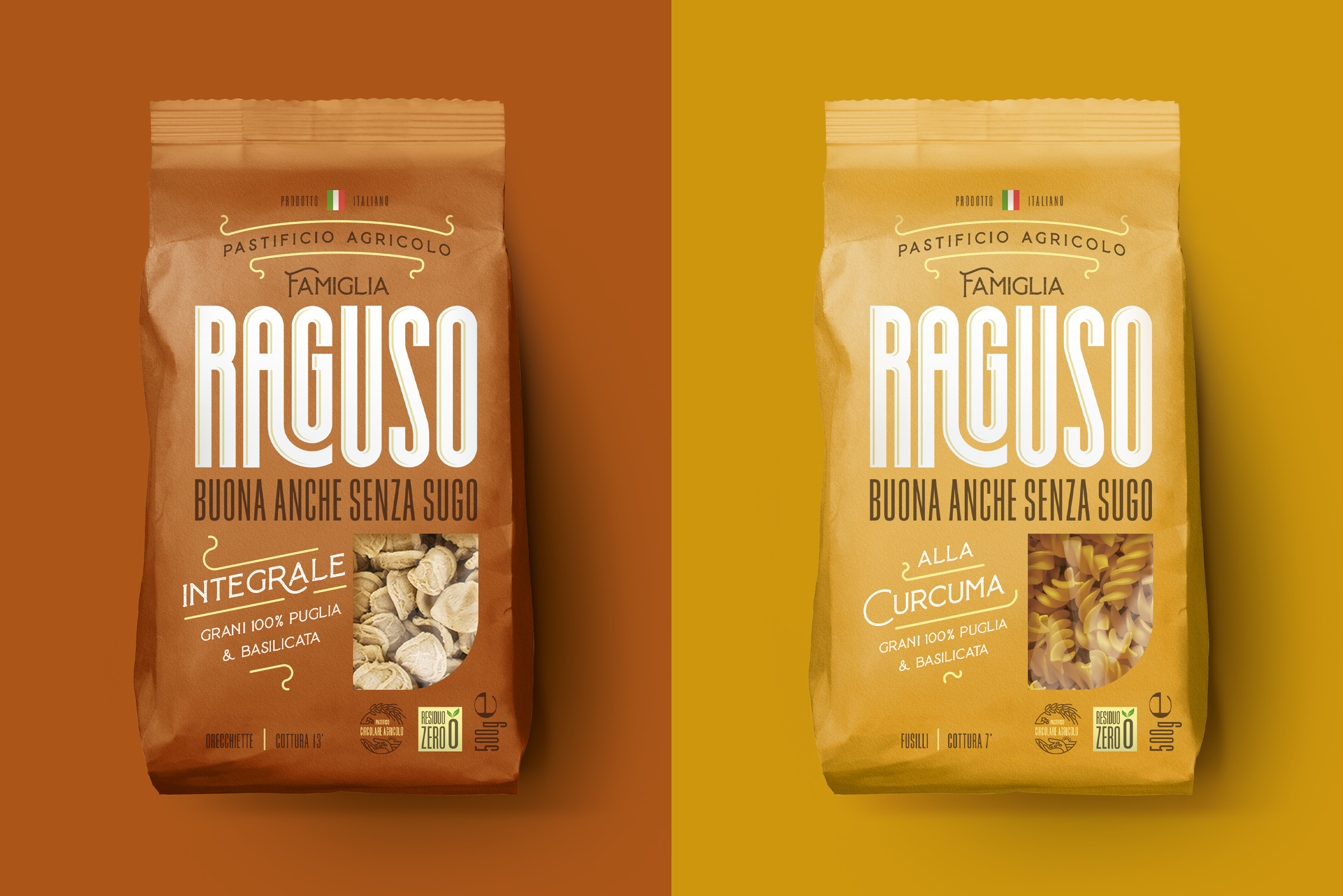
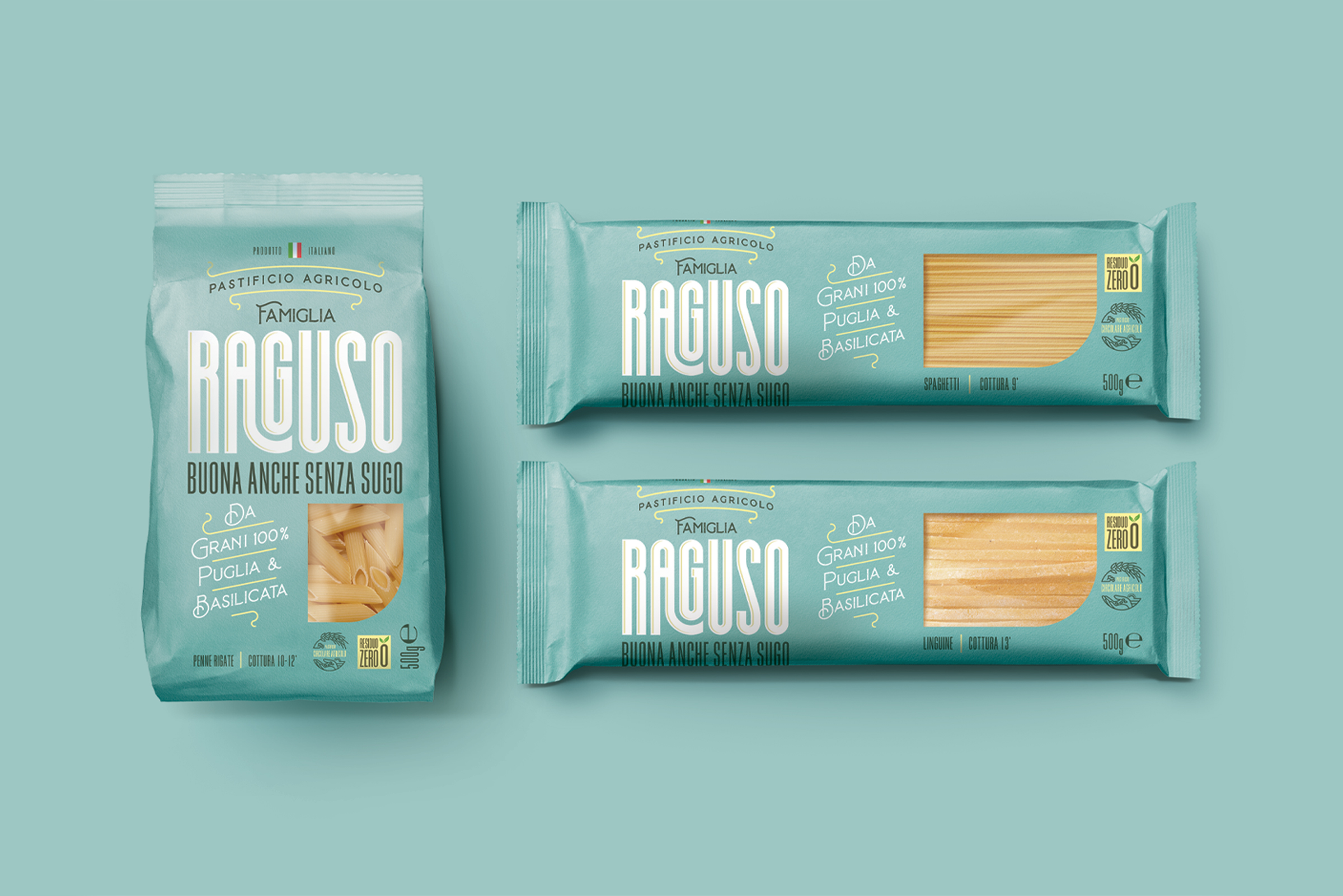
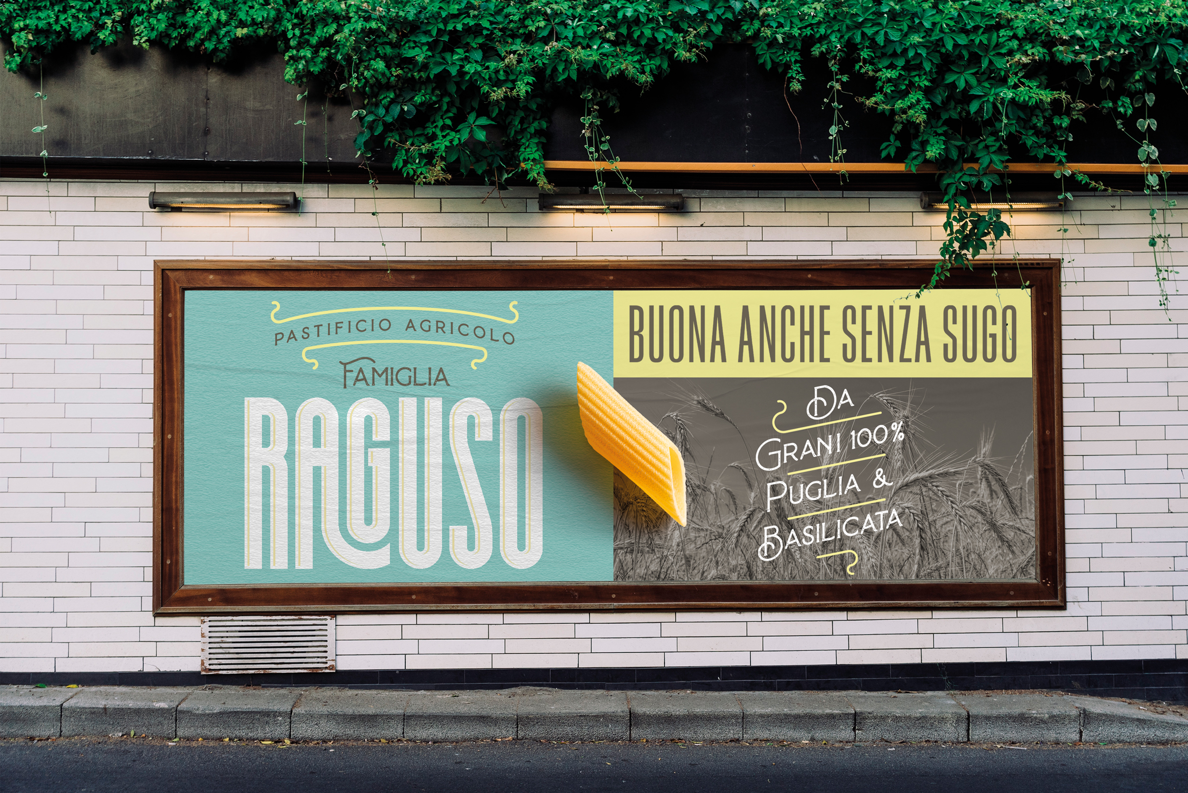
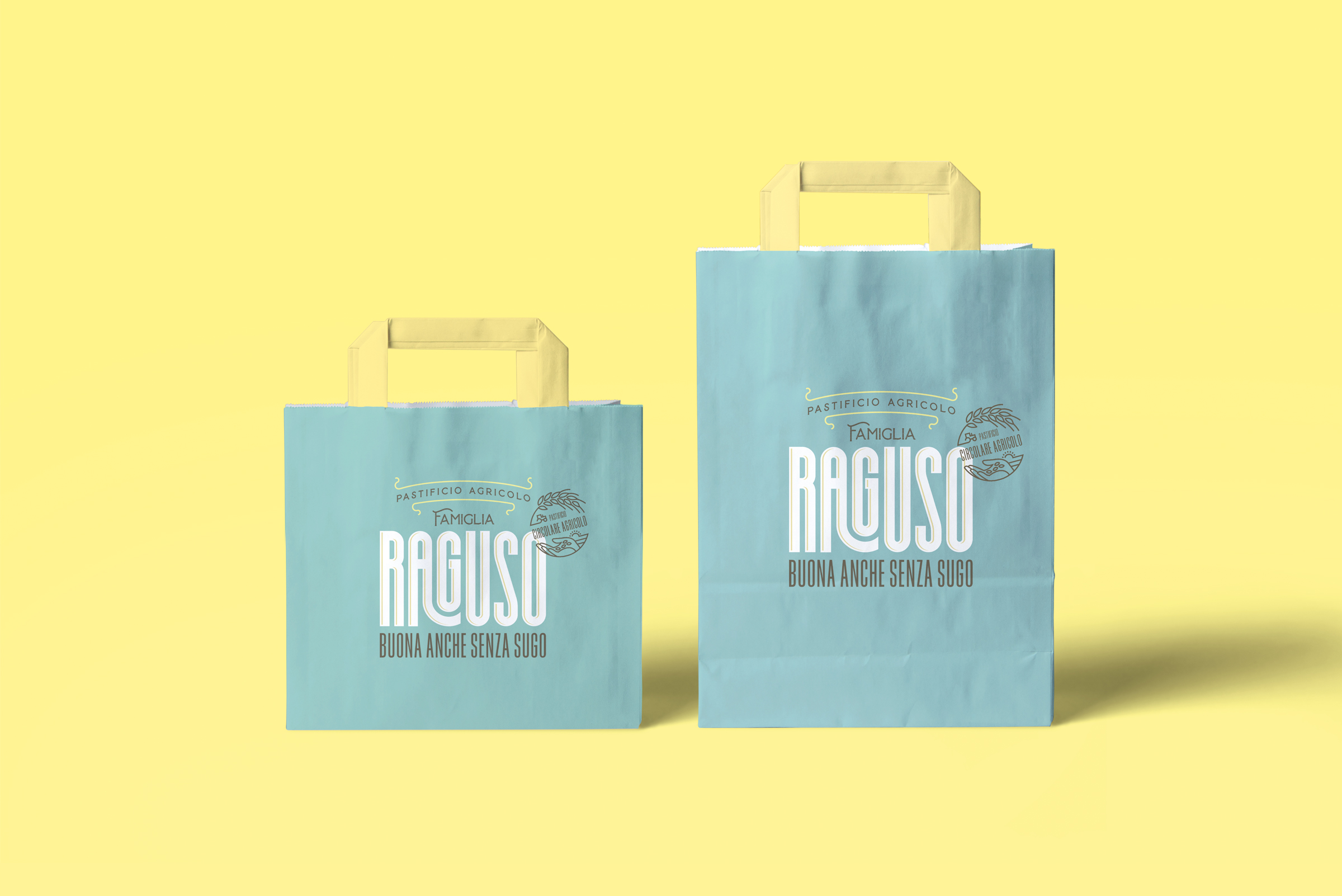
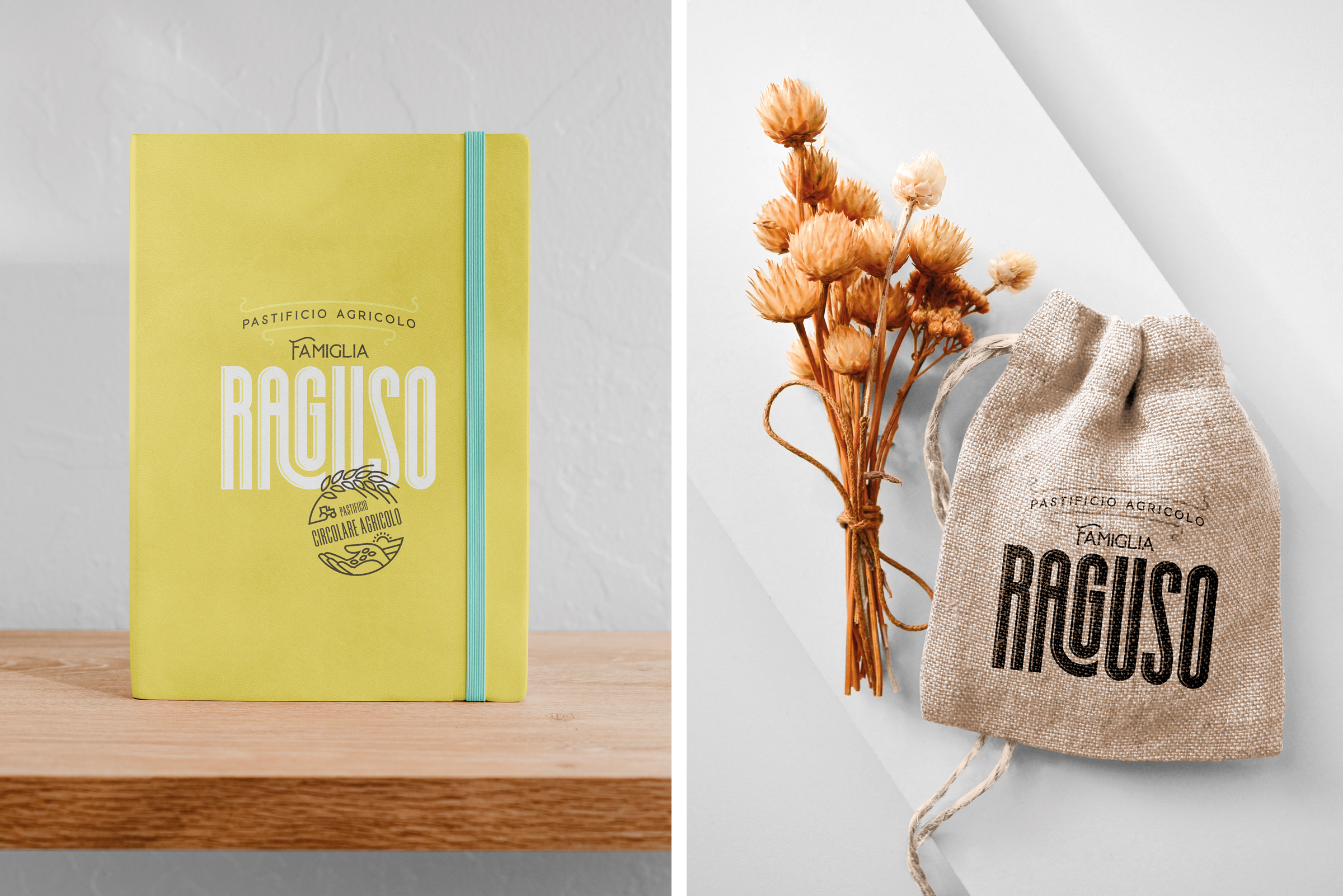
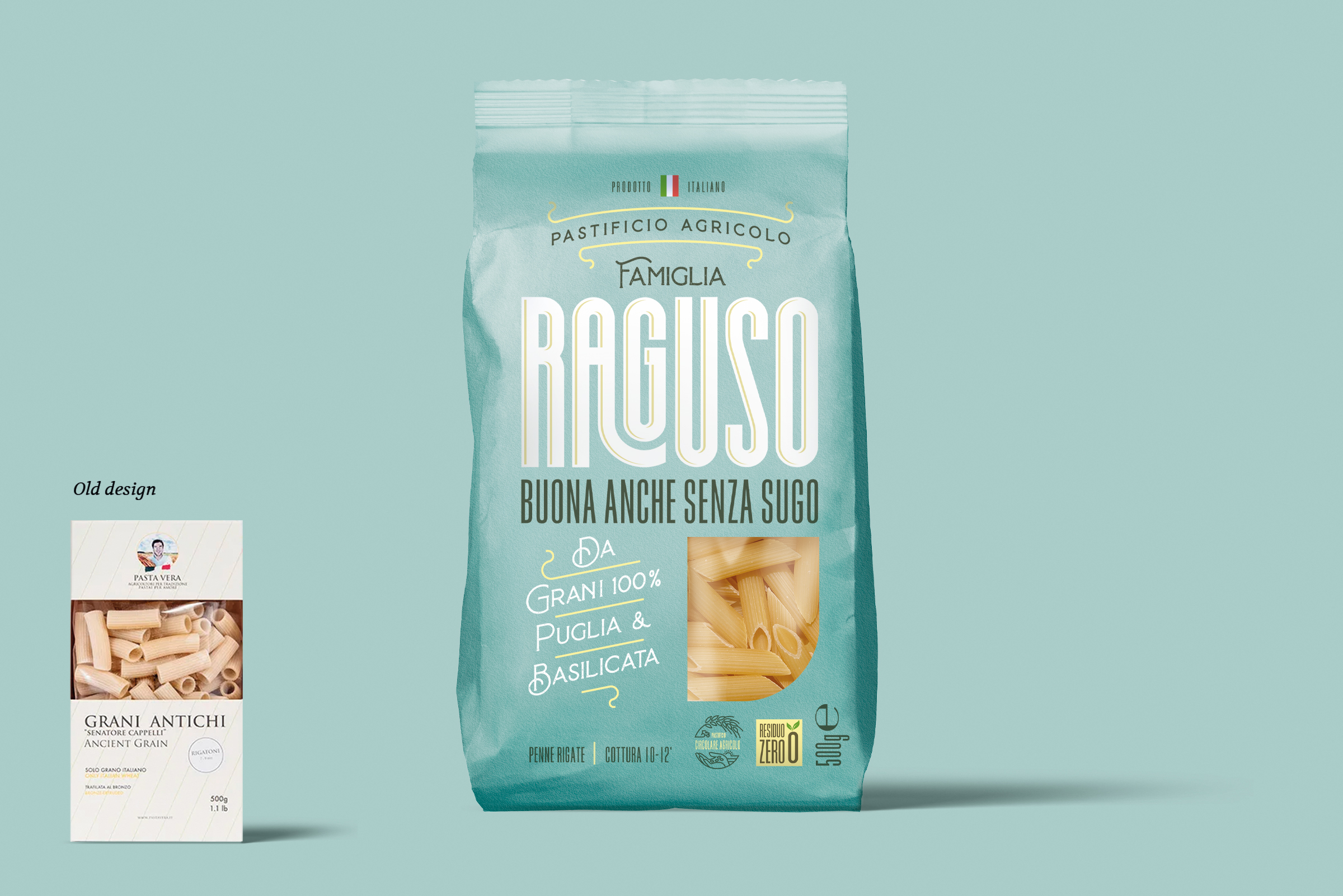
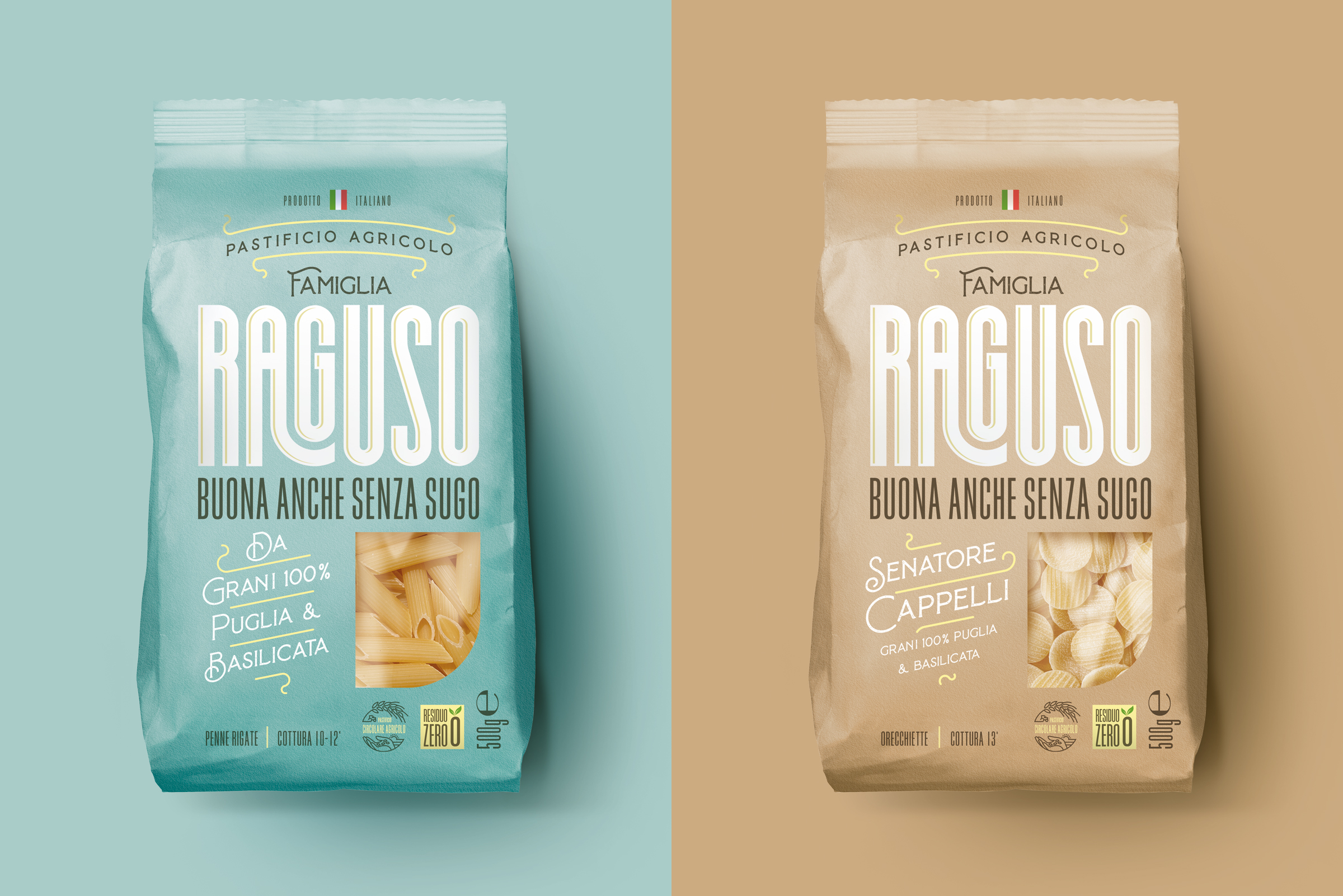
NEOM’s packaging design for Pasta Famiglia Raguso captures the rich heritage of Agricola Cooperativa Vera. Inspired by the 1950s Italian style, the design employs a contemporary visual language with fresh colors, emphasizing the pasta’s vibrancy and differentiating product variants. The package communicates four compelling “Reasons to Believe,” highlighting the family’s integral role, the product’s Italian origin, zero residues, and the company’s commitment to circular farming and environmental sustainability, garnering positive feedback from buyers and the public. Combining a delicate typeface fused with a bold art-deco-inspired font creates a beautifully balanced design system.
Agricola Cooperativa Vera was founded in 2012 by the Raguso brothers as the natural result of an old family tradition of farmers producing wheat. The Raguso family has always stood out because of its extensive experience in farming, especially the direct production of 100% Italian wheat, handed down from generation to generation. The passion for quality and love for the area led to the start of a supply chain path that enables control of each passage, ensuring the minimal environmental impact.
The year of great change was 2020 with the project of new investments and a more focused strategy in the mass retailing and Hospitality Industry channels. This is why there was the need to reposition the pasta offer to the public as Pasta Famiglia Raguso (Ragusa Family Pasta). Strategy: The strategy can be summarised in three simple yet important points: 1) create a defined brand positioning, closely connected to the family where everything originated and the intense flavour of the claim “good even without sauce”; 2) change the name (Pasta Vera), difficult to defend and too generic, to one with more personality, character and, most important, with greater links to the family, thus able to be bearer of the lasting values that are a feature of the brand; 3) create the new brand and range identity able to spread the positioning clearly and memorably yet also making it easy to distinguish amongst the various type of product offered. Project: We developed the creative study exploring the three reference conceptual areas for the brand in the sector it operates in. In particular, one of the proposals recalls the economic boom years of the 1950s, a time which is and remains the most respected icon of an Italian style because of its high energy and strength. The visual language is purposely simple and direct for a contemporary interpretation of that golden era.
The colour is fresh and suitable for highlighting the wonderful colour of the pasta and imprinting a strong brand spirit. Other colours, also with modern tones with a touch of ‘retro’, are used to differentiate the different variants in the range. Four ‘Reasons to Believe’ (ed. note: there’s certainly no lack of content), with a well-organised layout, close the construction of this captivating package: 1) ‘pastificio agricolo famiglia Raguso’ (Raguso family farm pasta factory) which conveys the important human and family existence; 2) ‘Da grani 100% Puglia e Basilicata’ (from wheat 100% grown in Puglia and Basilicata) to underline the completely Italian origin; 3) the innovative ‘Residuo zero’ (zero residues) certification declaring the lack of residues in the product; 4) the ‘Pastificio Agricolo Circolare’ (the circular farm pasta factory) to explain how everything is kept within the company and the great attention given to the environment. A stupendous project that is garnering good feedback from buyers and public.
