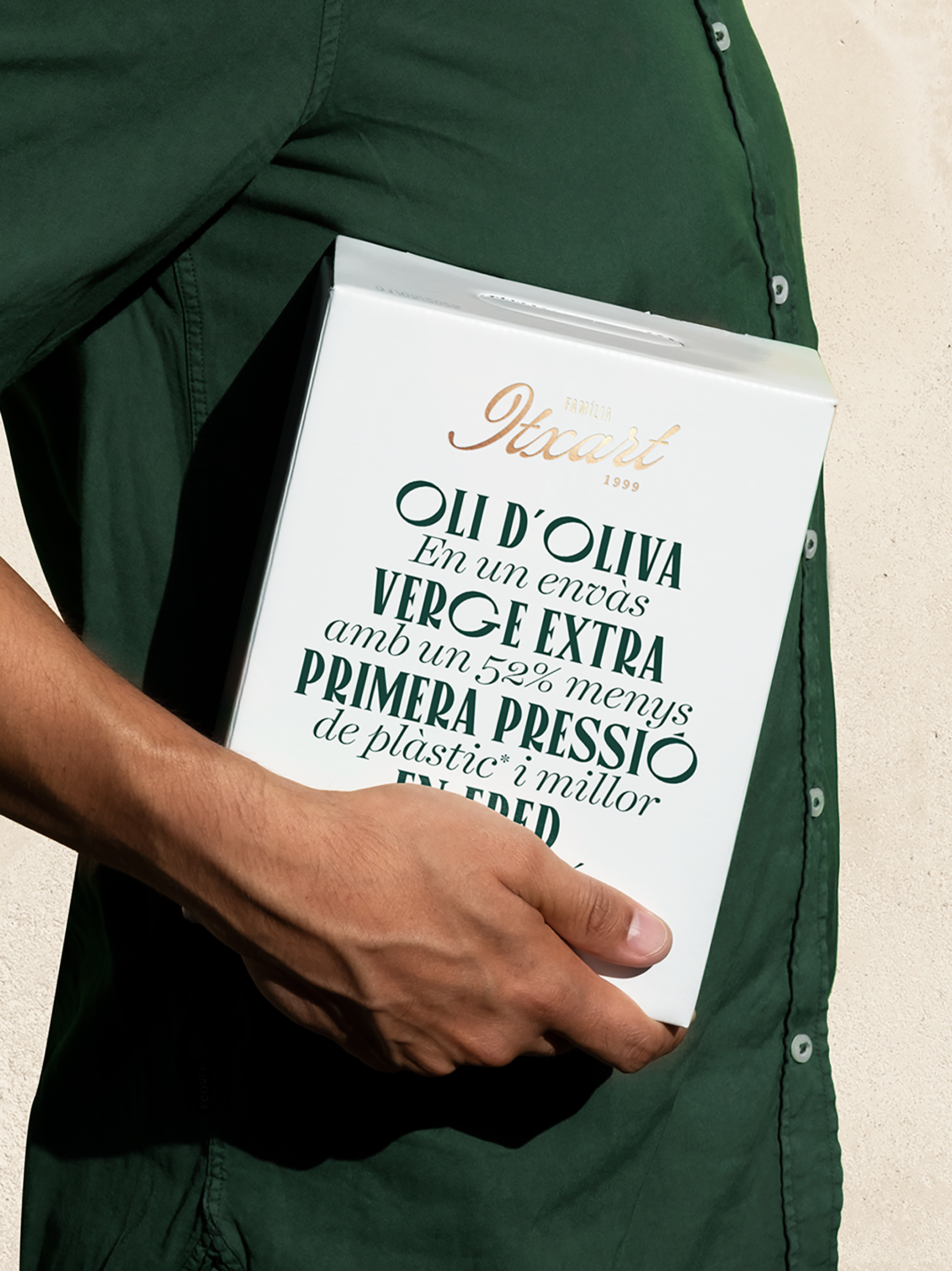
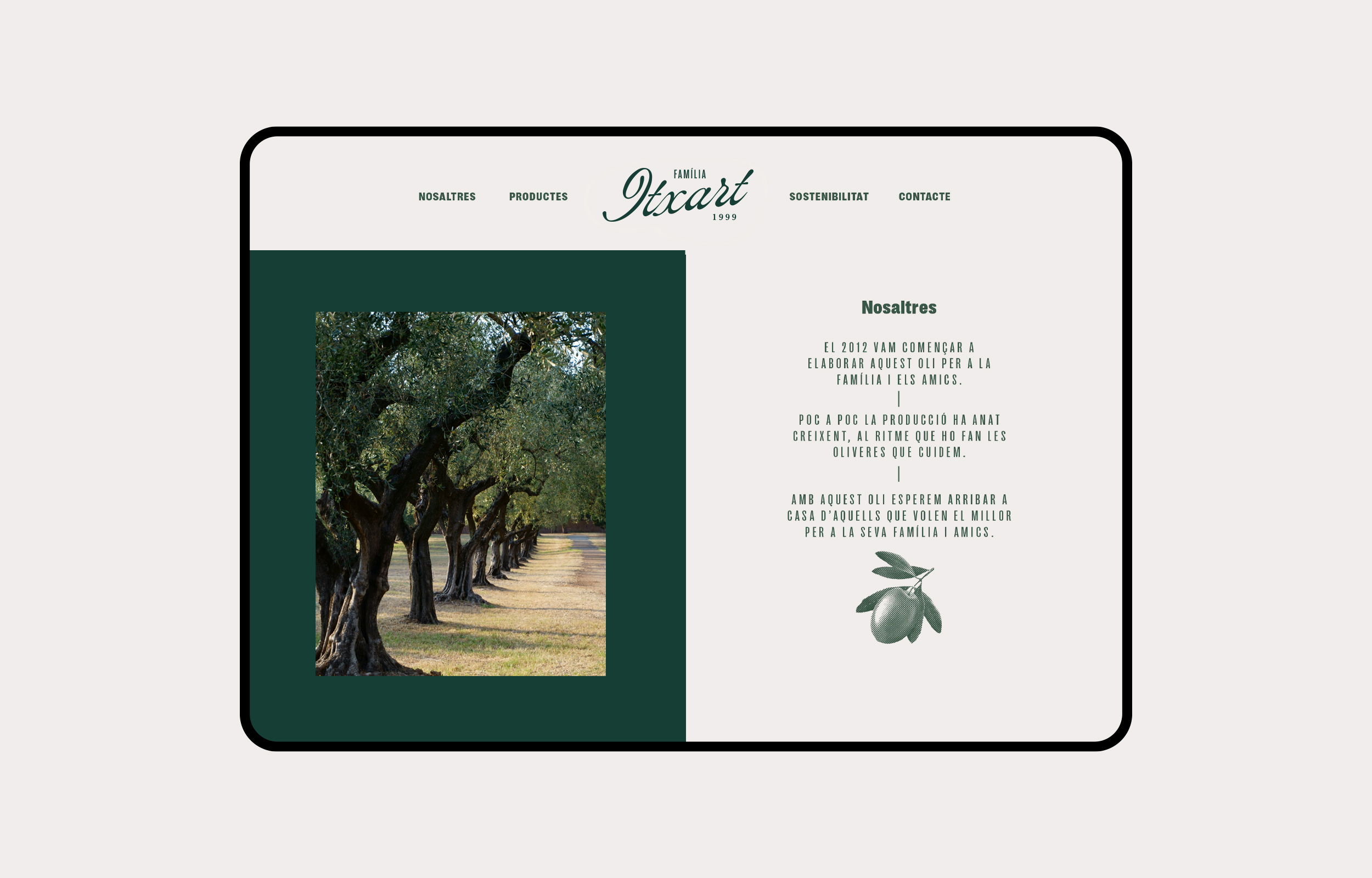
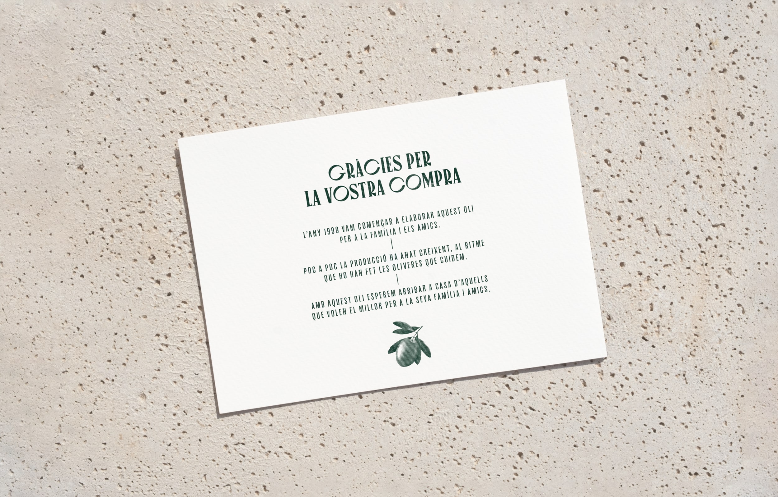
Laia Fusté Studio’s packaging design for Itxart Olive Oil showcases the essence of the two generations and their distinct voices within the family legacy. Employing a captivating art deco aesthetic, the packaging features a rich green hue that not only reflects the olive oil’s natural origins but also resonates with the lush landscapes of Catalonia. The typographic combination creates a visual language that articulates the unique discordance between Joan’s focus on the oil and Maria’s emphasis on sustainability, resulting in a packaging design embodying the brand’s rich heritage.
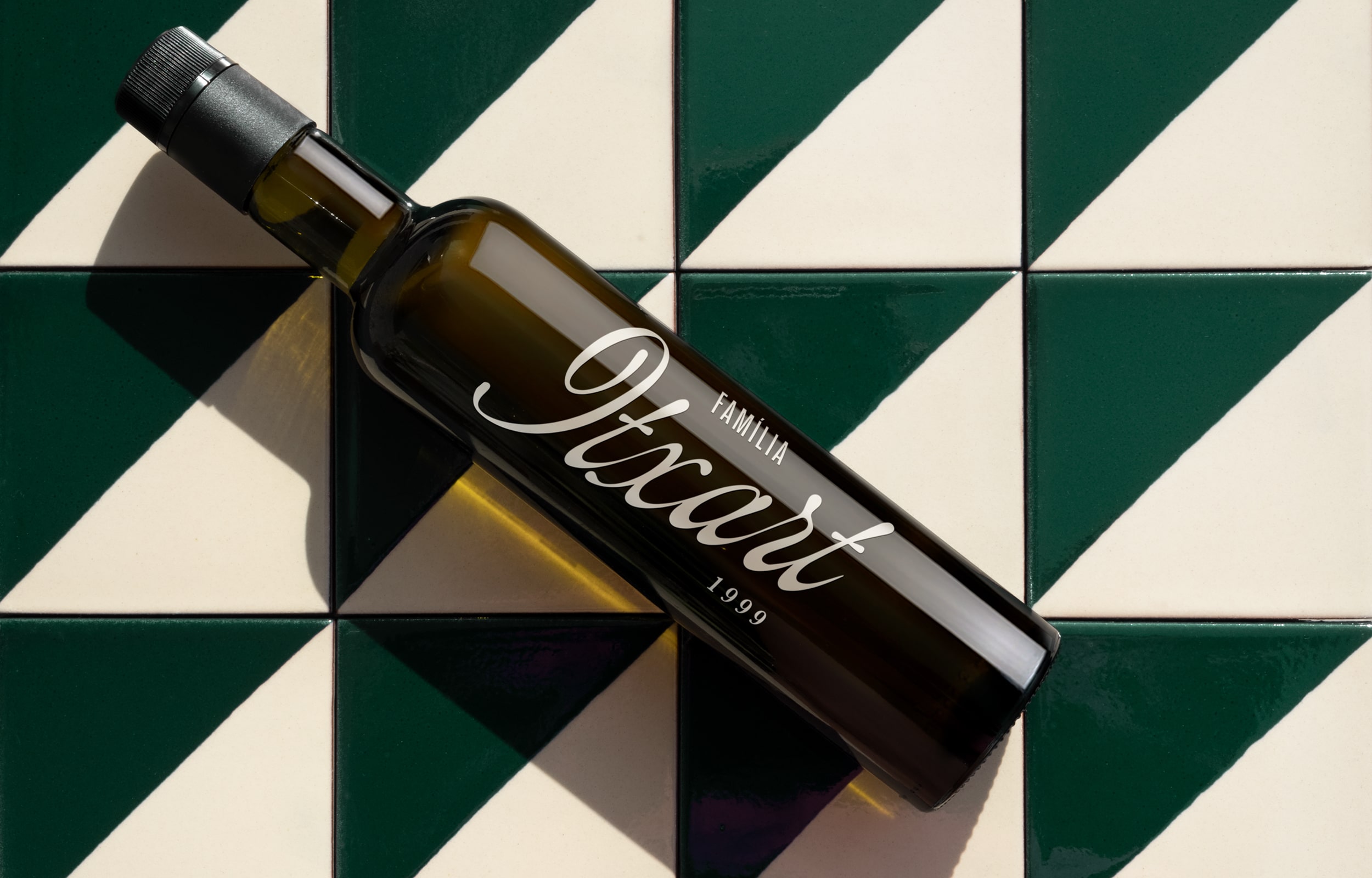
Two generations, two voices, one visual language. The Itxart family has been producing olive oil from the olives they cultivate themselves for about 25 years. Both the father and the daughter, the first and second generations of Itxart, came to the studio. As they told us about the project, we realized that for Joan, the father, everything revolved around the oil, while Maria was concerned about other aspects such as sustainability and environmental respect.
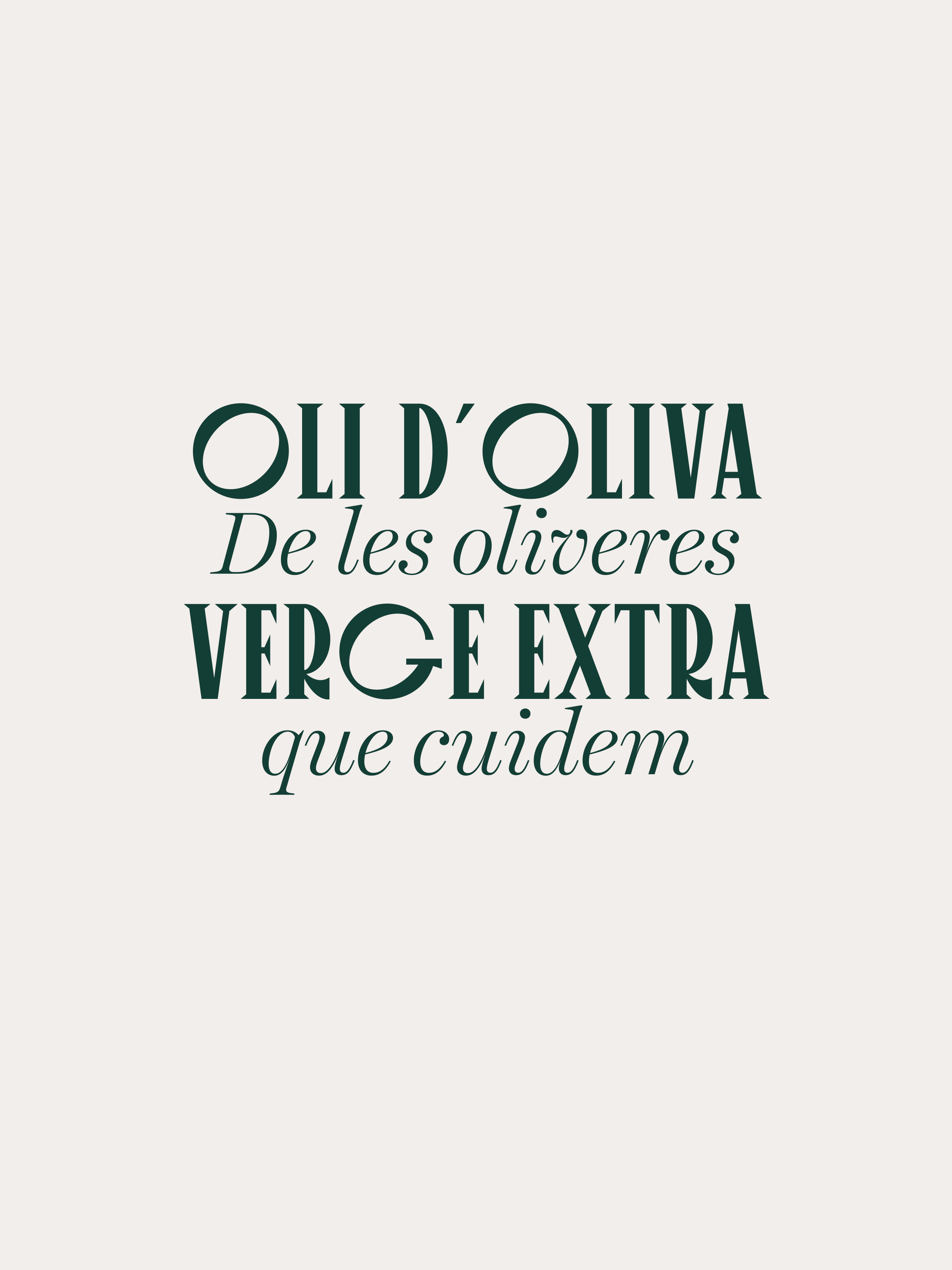
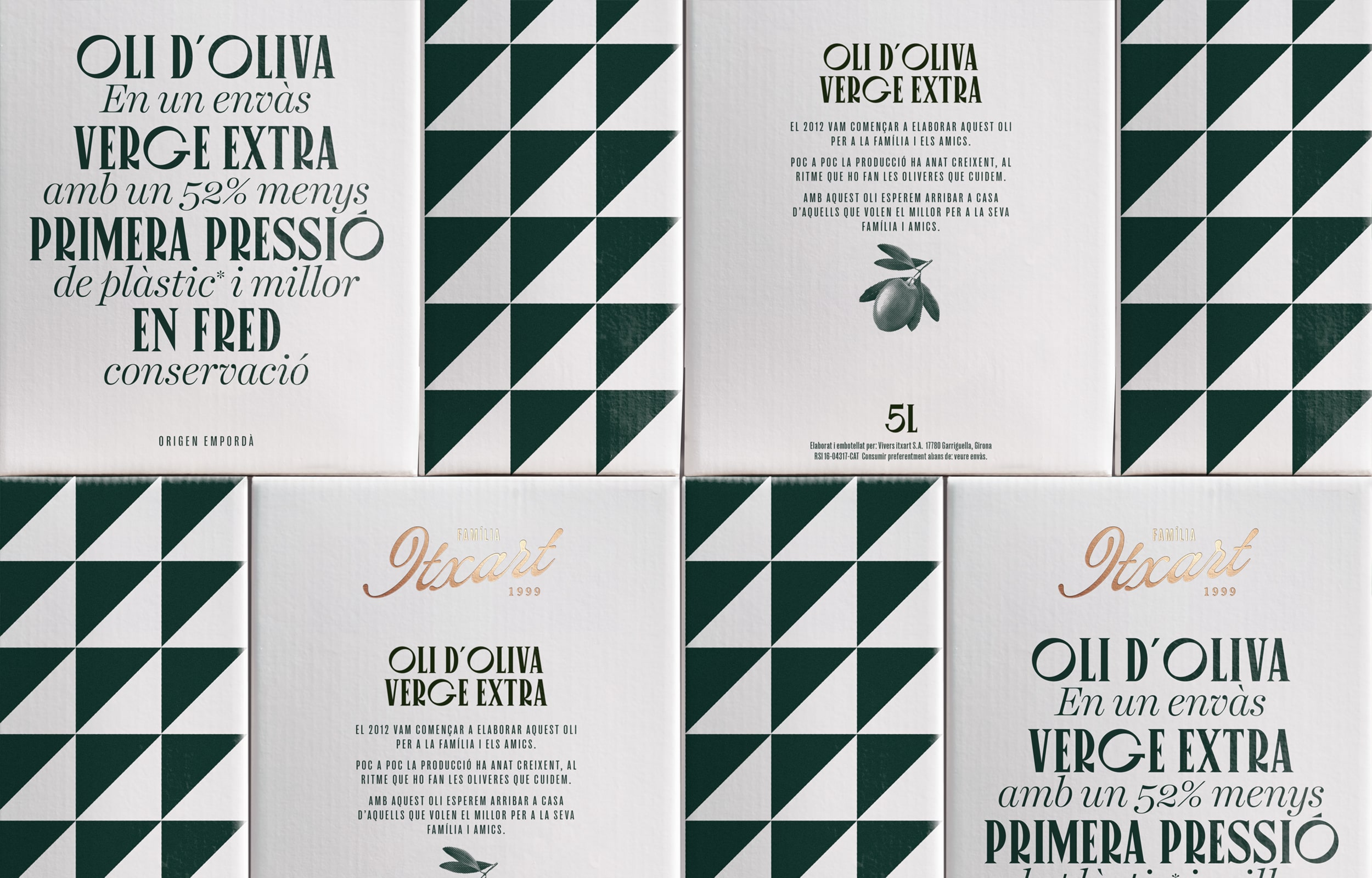
We understood that this discordance of narratives is what made the brand unique and richer. We opted for a visual language based on typographic combinations that represent the two voices, the two generations. With Maria’s concern for sustainability, we replaced the traditional plastic jug with a ‘bag in box’ format whose design incorporates the tile pattern found in the family’s home backsplash, which is characteristic of the farmhouses in Catalonia.
