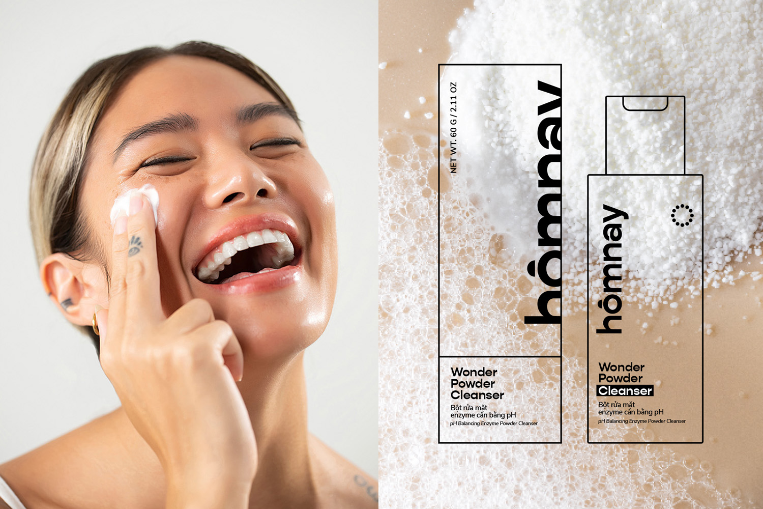
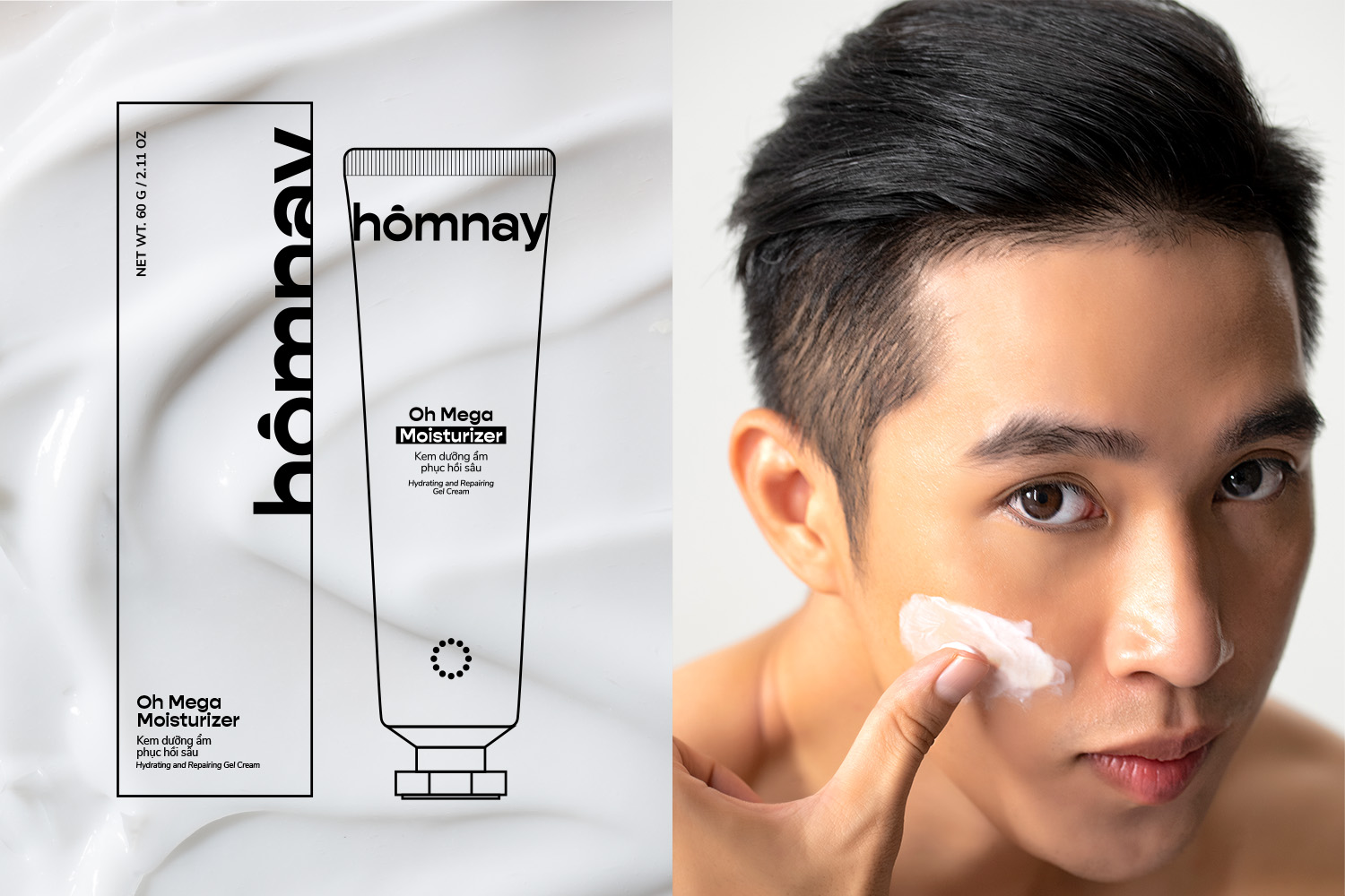
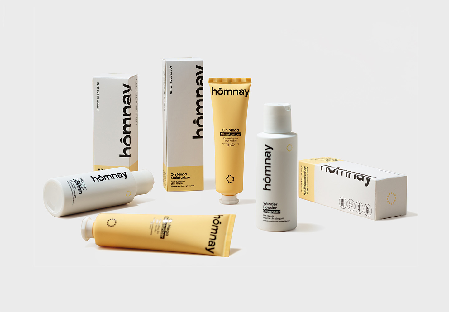
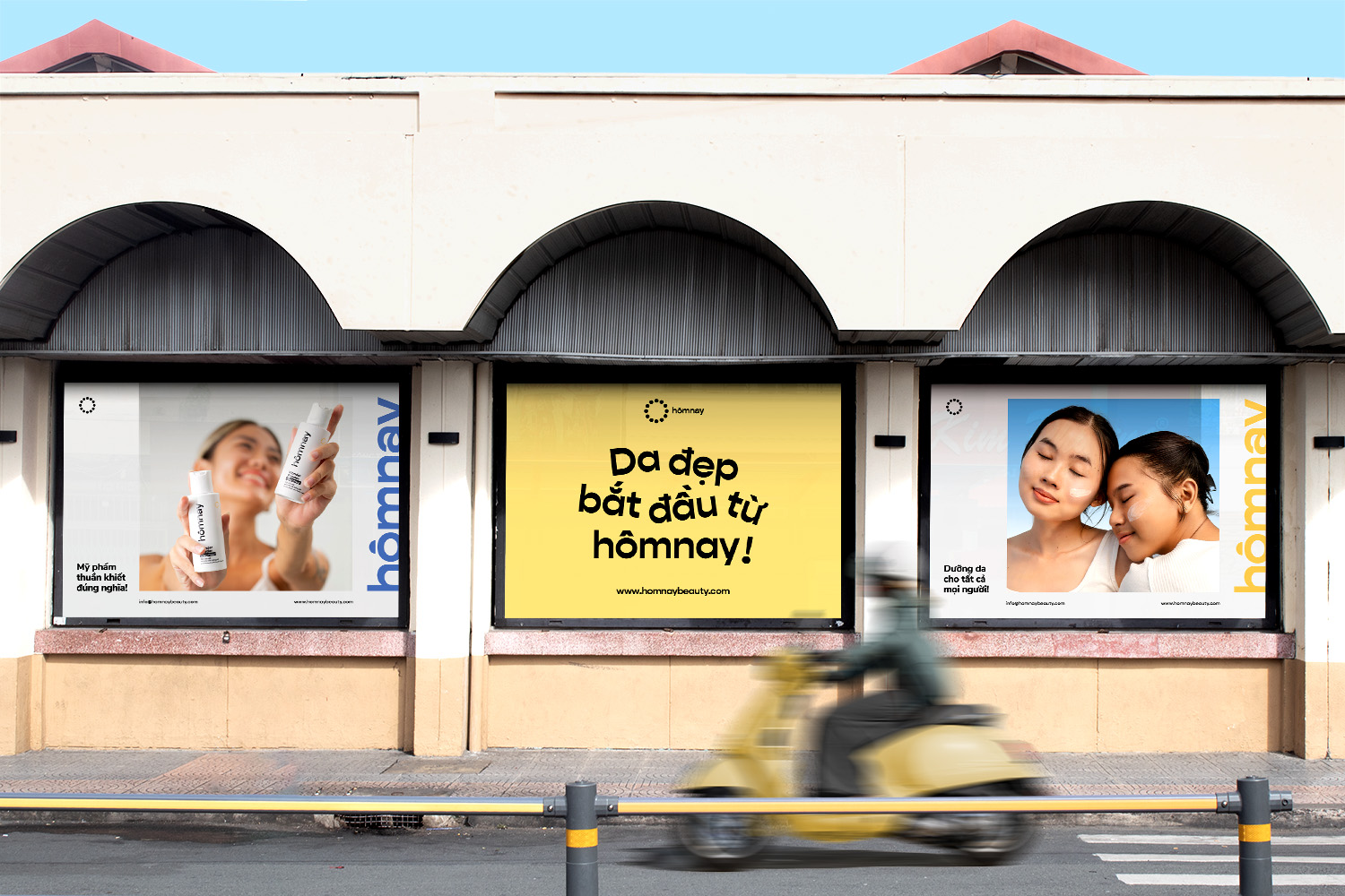
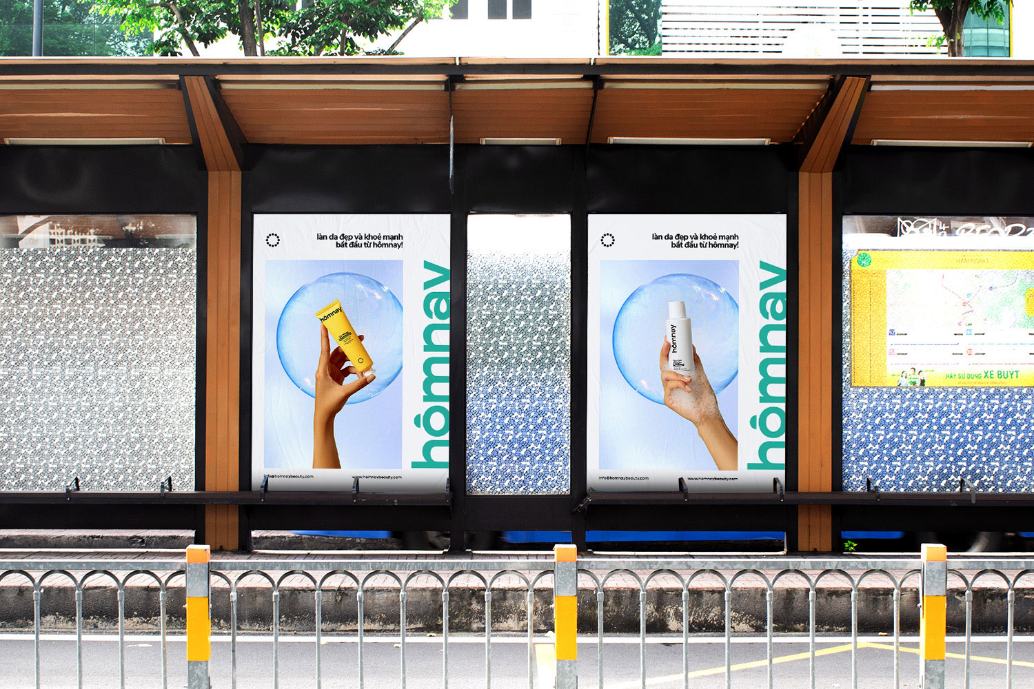
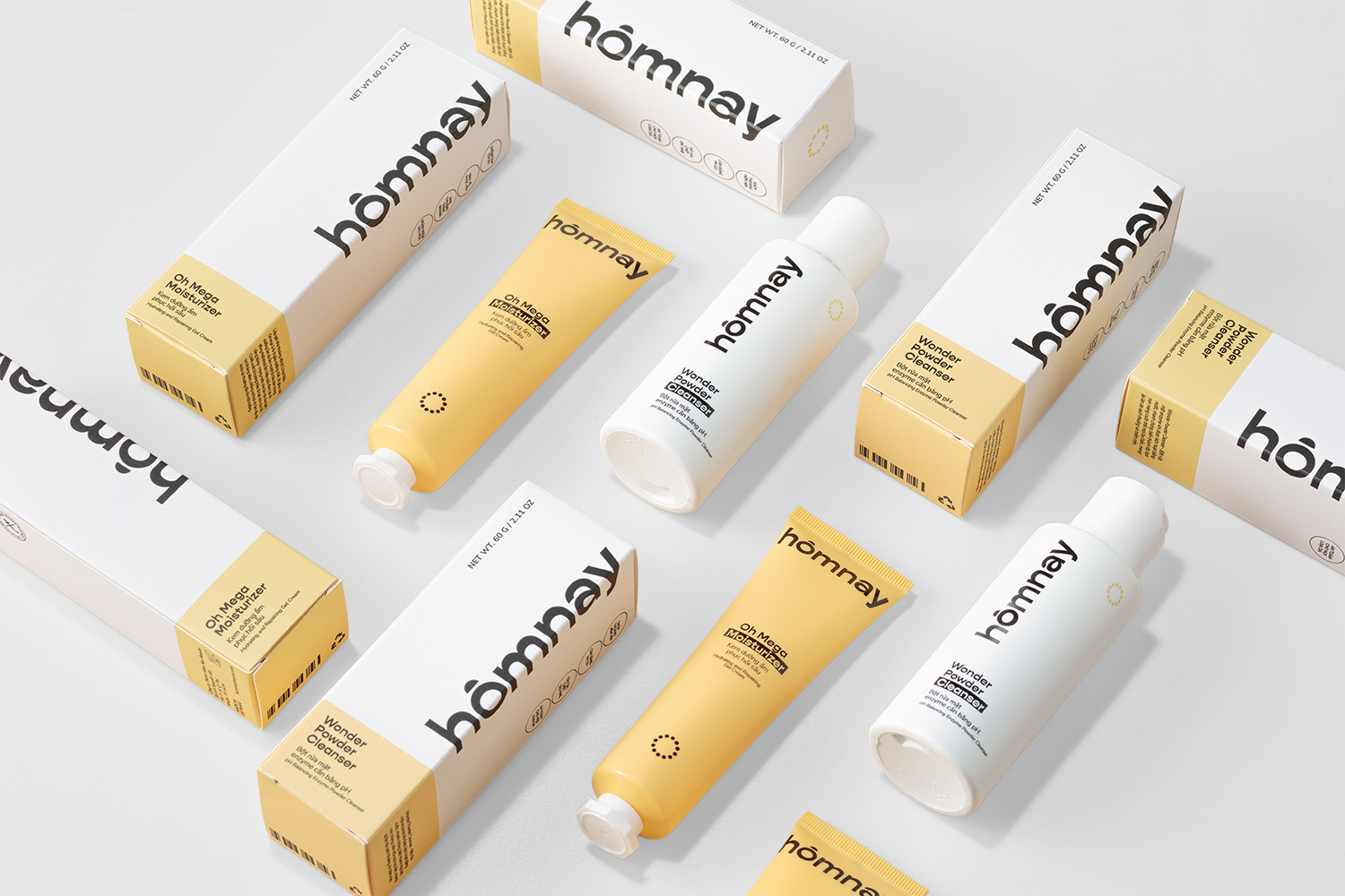
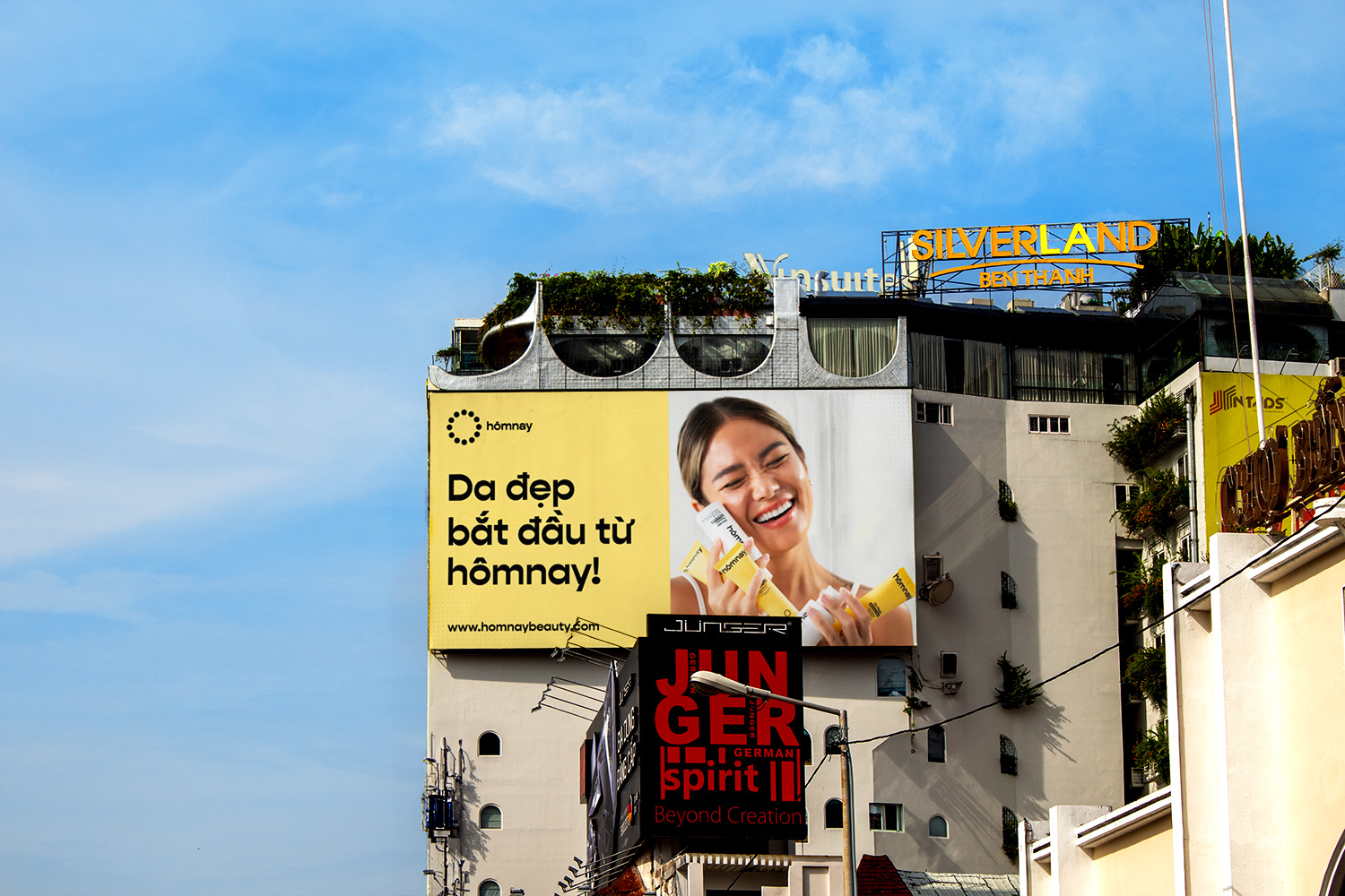
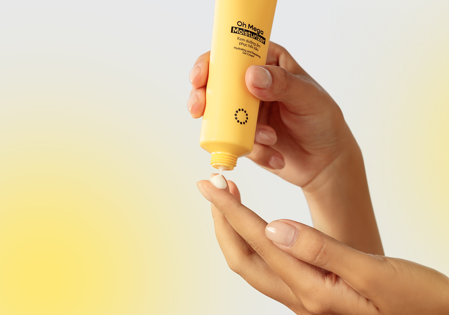
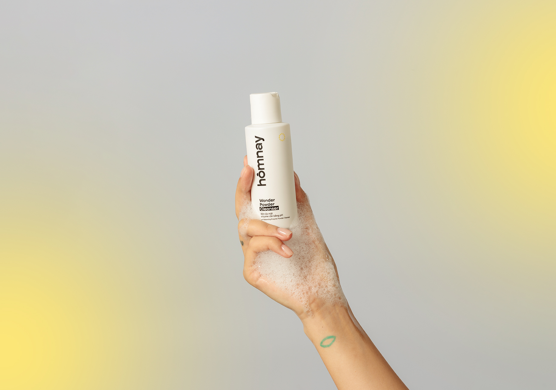
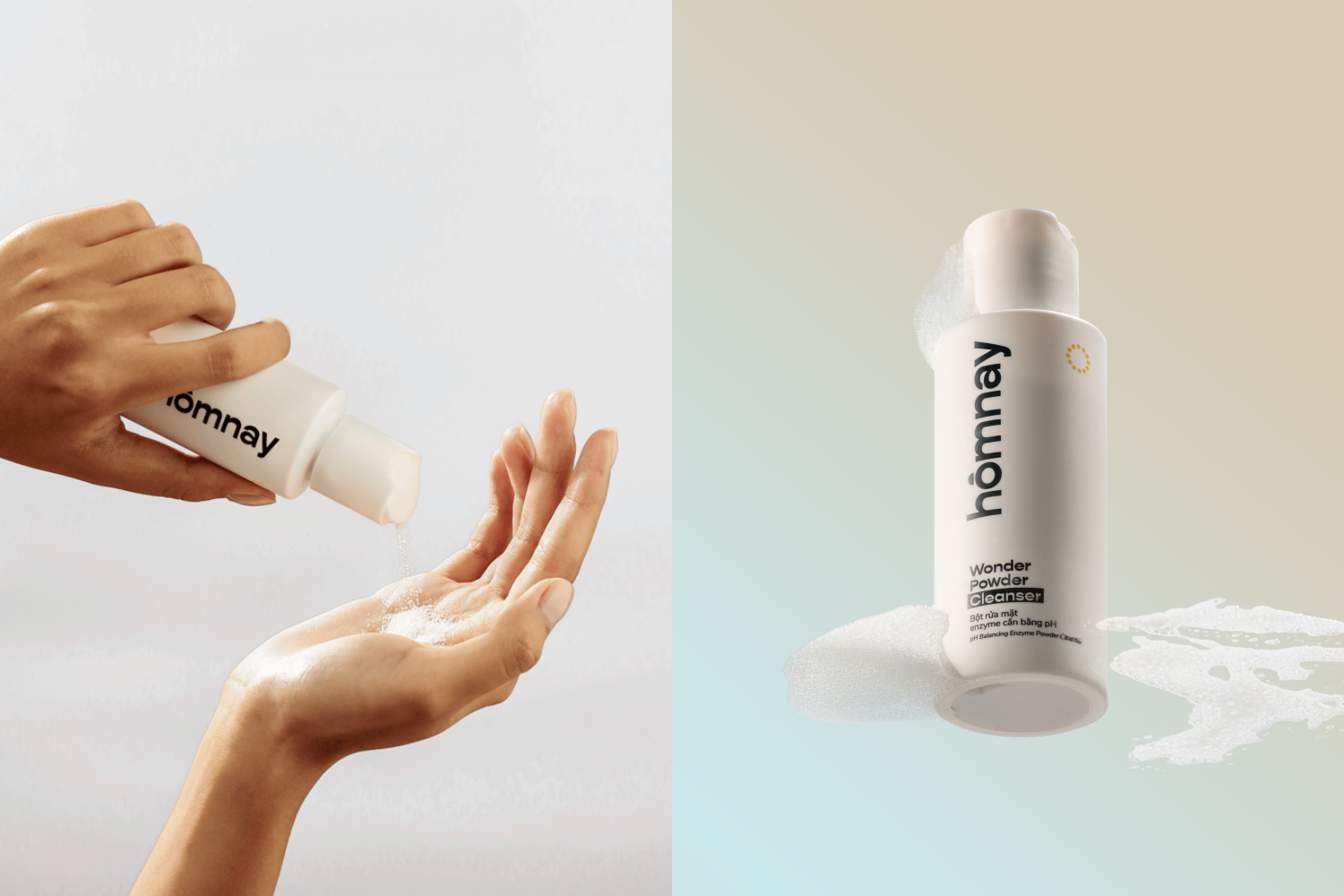
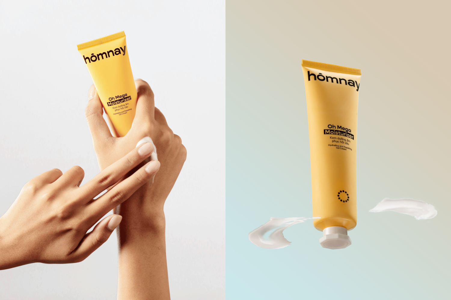
Xolve Branding’s packaging for homnay represents a streamlined approach to skincare, addressing the confusion consumers can face in a saturated market. The three-fold strategy—Simple Beauty, True Clean Beauty, and City Solutions—is visually communicated, simplifying product selection and adapting to urban lifestyles. The packaging design ensures a hassle-free experience, skincare benefits without irritation, and products tailored to dynamic urban routines. Xolve’s visual elements, including a clock-inspired logo and a warm color scheme, amplify homnay beauty’s authenticity and reliability, making it a testament to simplicity and a standout in the complex skincare sphere.
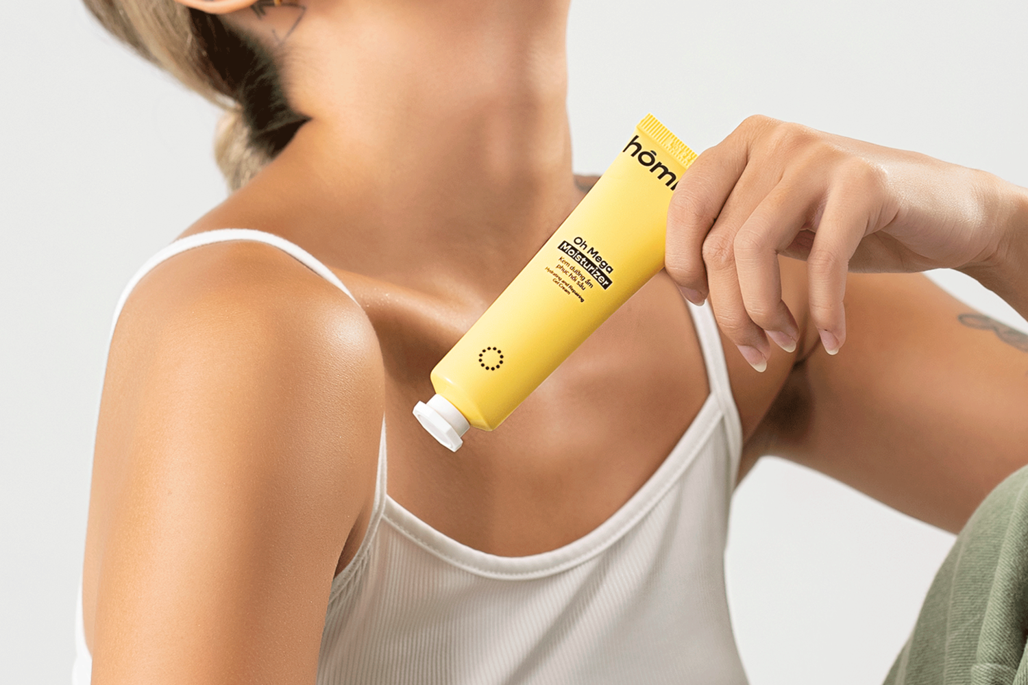
Challenges: Skincare decision-making Choosing skincare becomes a confusion amidst the surplus of options. Urban dwellers, juggling diverse lifestyles, face the uphill task of navigating through complex routines, ingredients, and their compatibility with varying skin types. The demand for a streamlined approach echoes loudly in a cluttered market, highlighting the need for reliable, simple solutions that resonate with busy, modern lives.
Solution: hômnay’s simplified approach to skincare hômnay beauty’s genesis was rooted in addressing this very challenge. Derived from the Vietnamese word for “today,” the brand embodies authenticity and simplicity, reflecting its core philosophy. Its collaboration with xolve sought to simplify the overwhelming skincare landscape. With a deep belief in the power of good habits for healthy skin, hômnay strategically designed a three-fold approach. First, the Simple Beauty regimen streamlined the selection process with five effective products, maintaining simplicity without compromising efficacy. Complementing this, True Clean Beauty focuses on purity, offering straightforward, authentic skincare essentials.
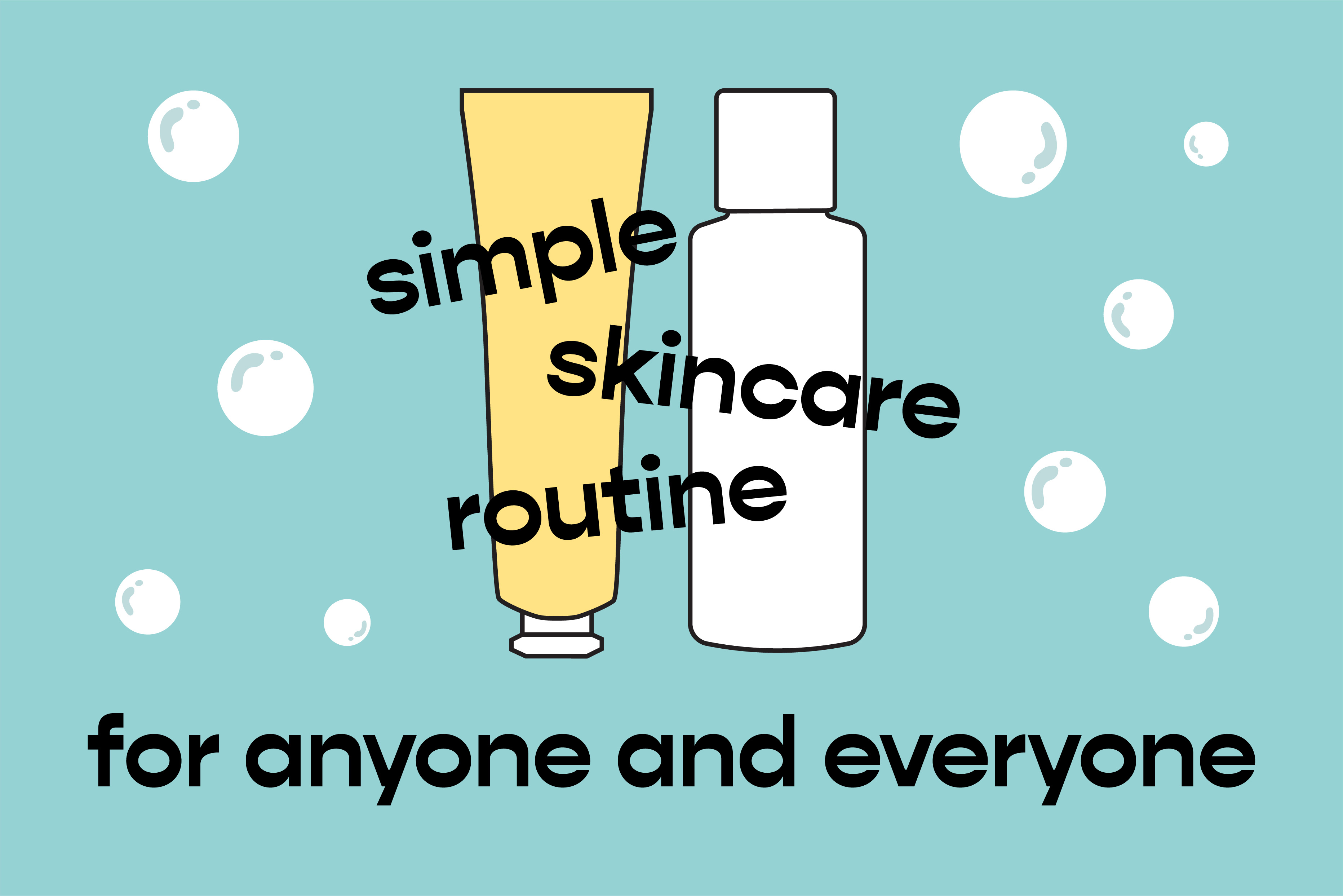
Lastly, City Solutions catered to the urban lifestyle’s specific skincare challenges, affirming the brand’s adaptability to the fast-paced city life. Brand values: addressing user needs At the core of hômnay beauty lie three foundational values catering to user needs. Ease became paramount, removing unnecessary complexities in skincare routines and promising a hassle-free experience. Quality stood unwavering, ensuring skincare benefits without irritation, and advocating for radiant, healthy skin. Fast & Active, a value resonating with modern lives, tailored products to match dynamic urban lifestyles, acknowledging and adapting to diverse users’ needs.
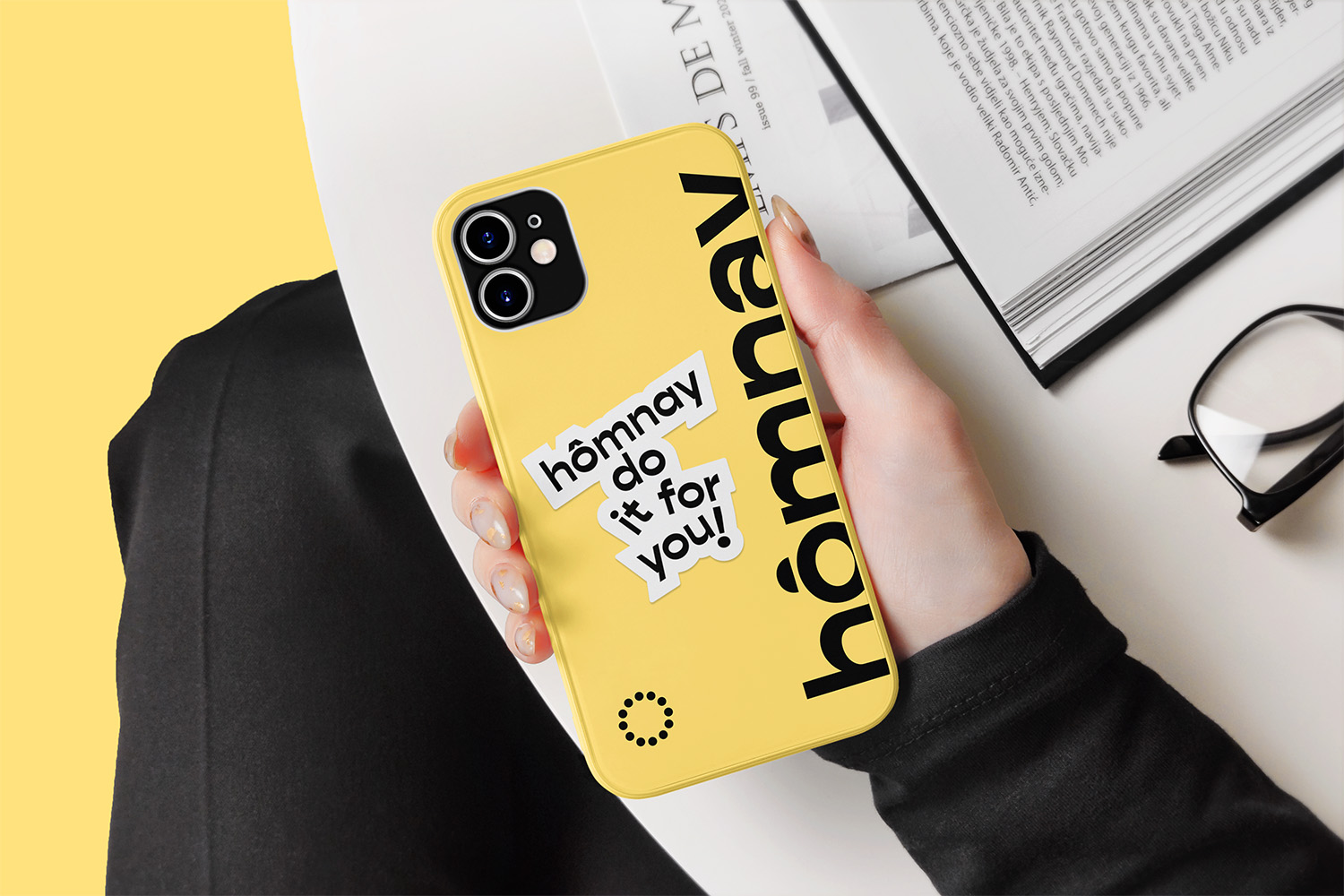
Visual approach: elevating authenticity and reliability The brand’s visual elements meticulously amplified hômnay beauty’s essence. xolve’s touch added reliability and inspiration, seamlessly aligning with customer insights. The logo’s representation of time’s flow through 12 clock timestamps echoed a simple, start-from-today mindset, embodying the brand’s core philosophy derived from its name. The warm color scheme, marrying yellow and sky blue, embodied the brand’s essence, representing the sun’s vibrance and a stress-free skincare narrative. Conclusion: hômnay beauty’s testament to simplicity and authenticity hômnay beauty emerged as an antidote to the convoluted skincare sphere, embodying authenticity and simplicity. Rooted in the essence of “hômnay,” the brand guided users in transforming habits into radiant, healthy skin. More than just a skincare brand, hômnay stood as a testament to simplicity and authenticity, seamlessly integrating into daily routines and guiding users towards healthier, glowing skin.
