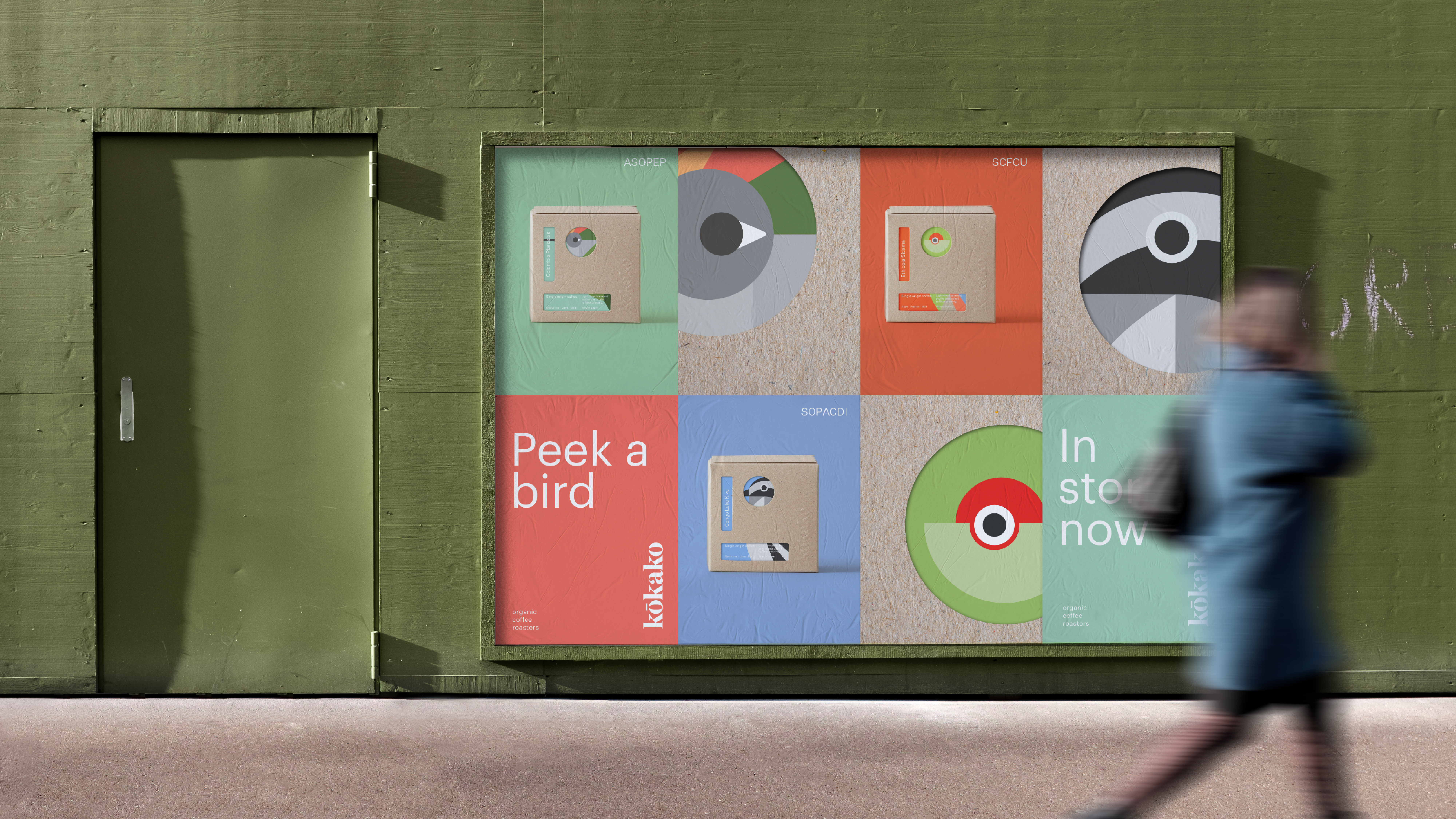
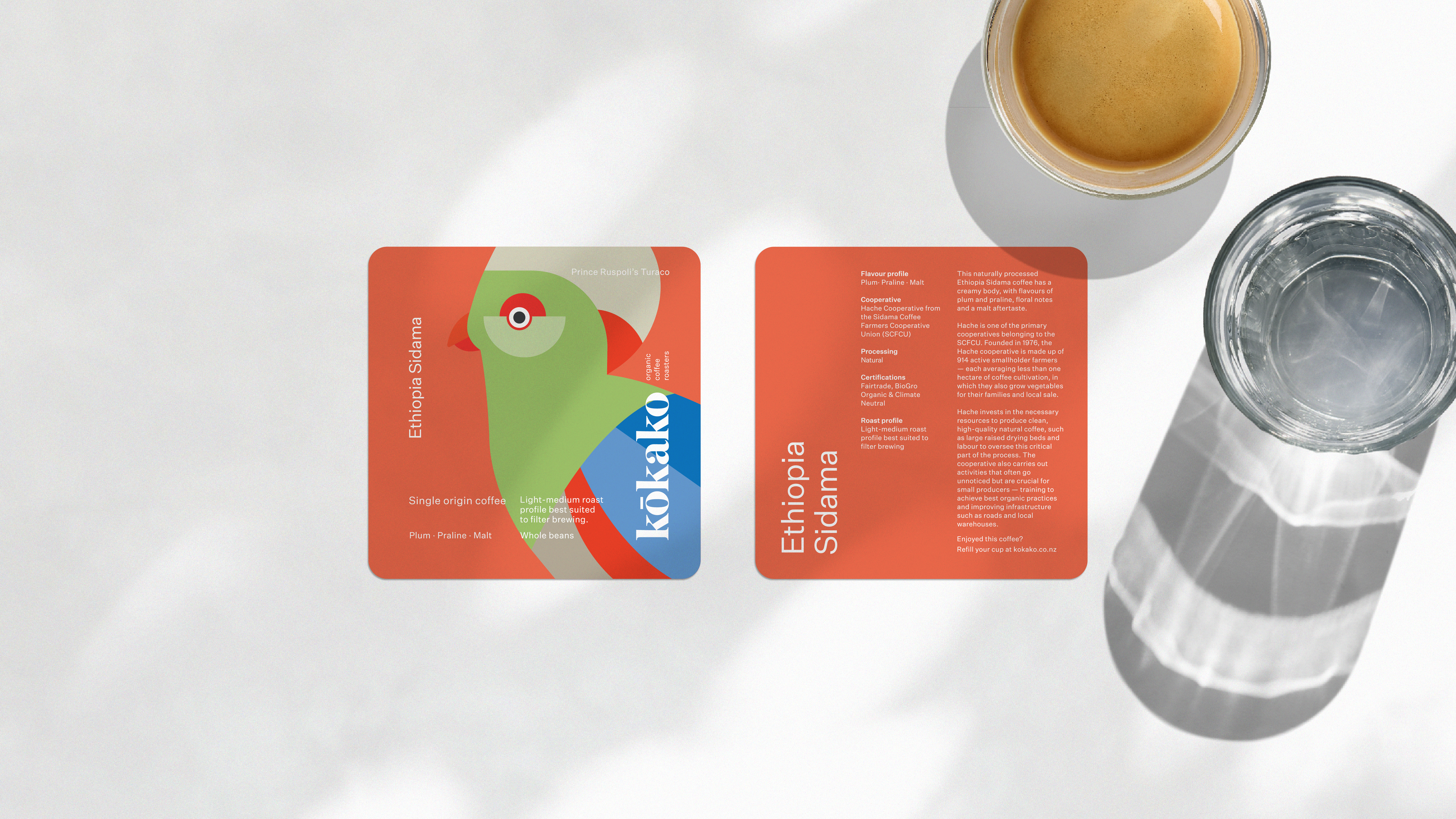
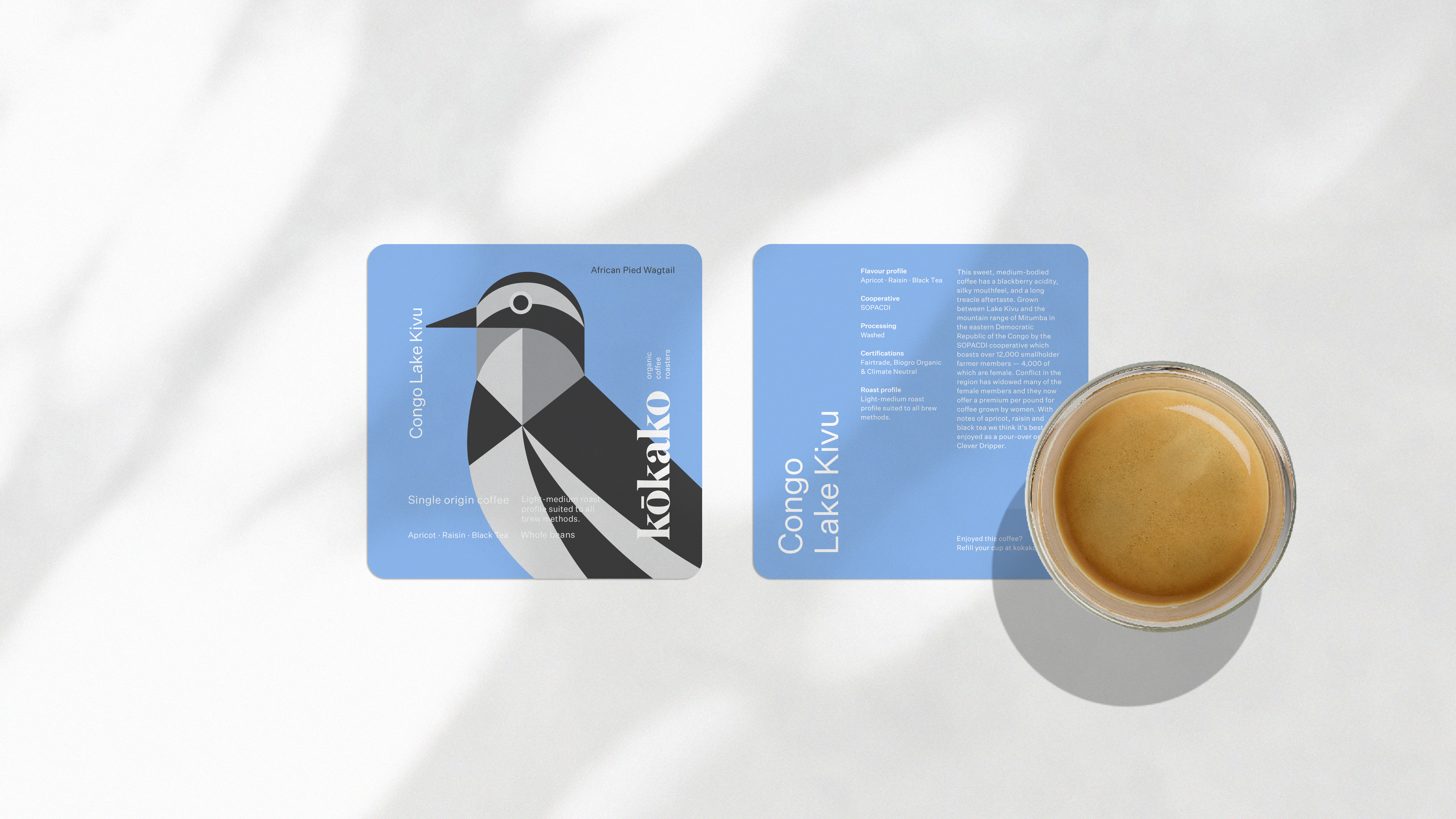
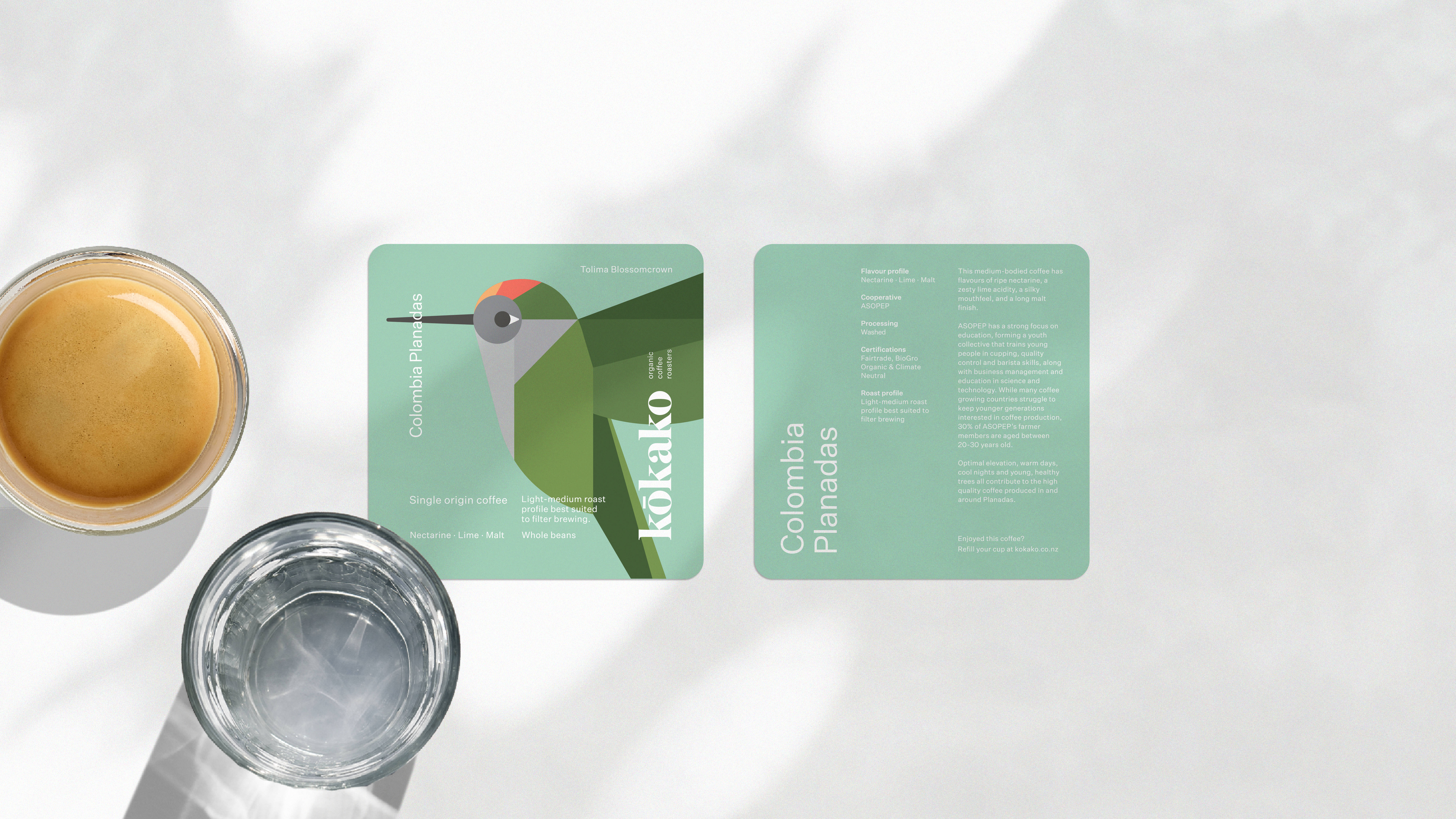
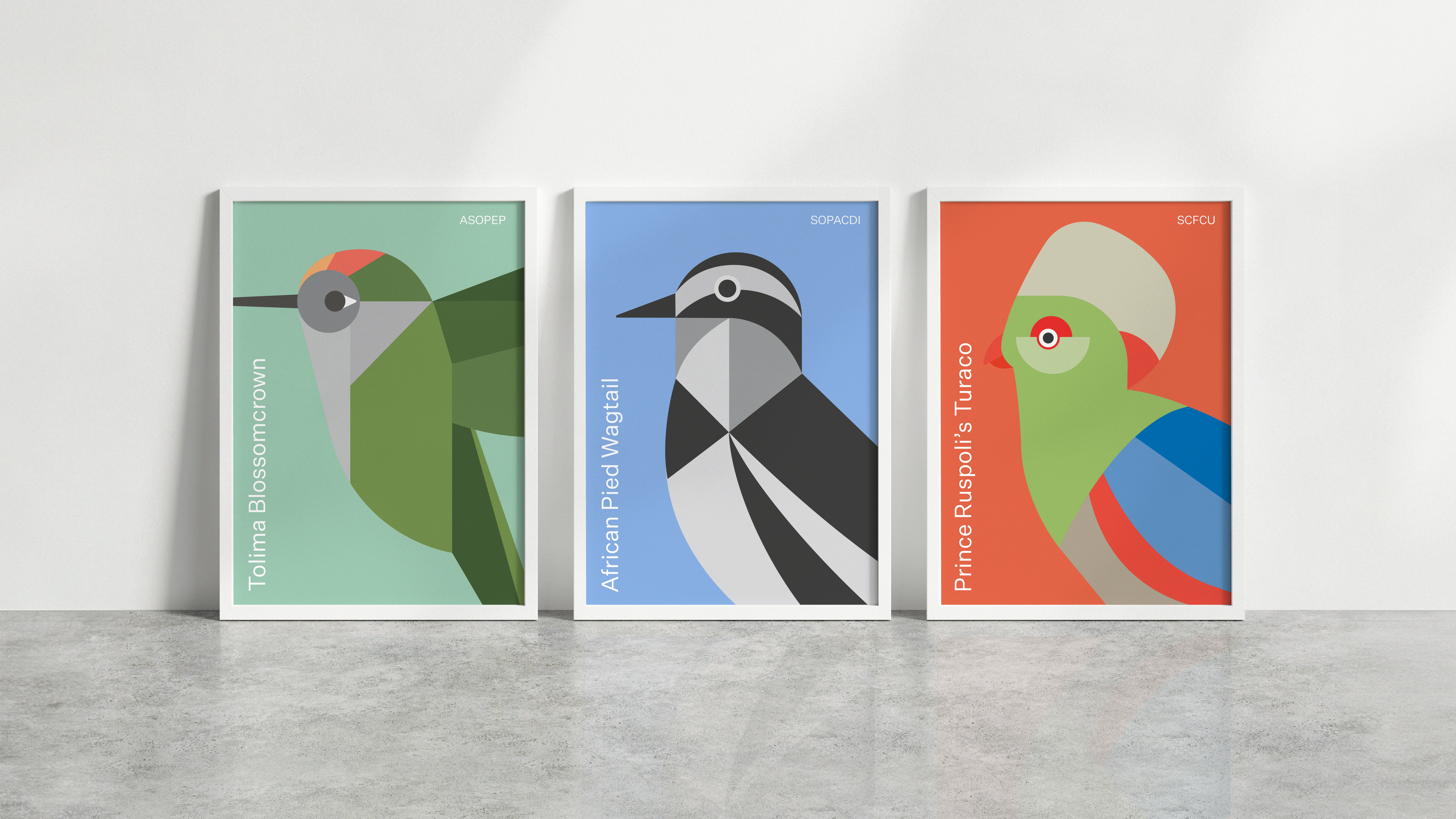
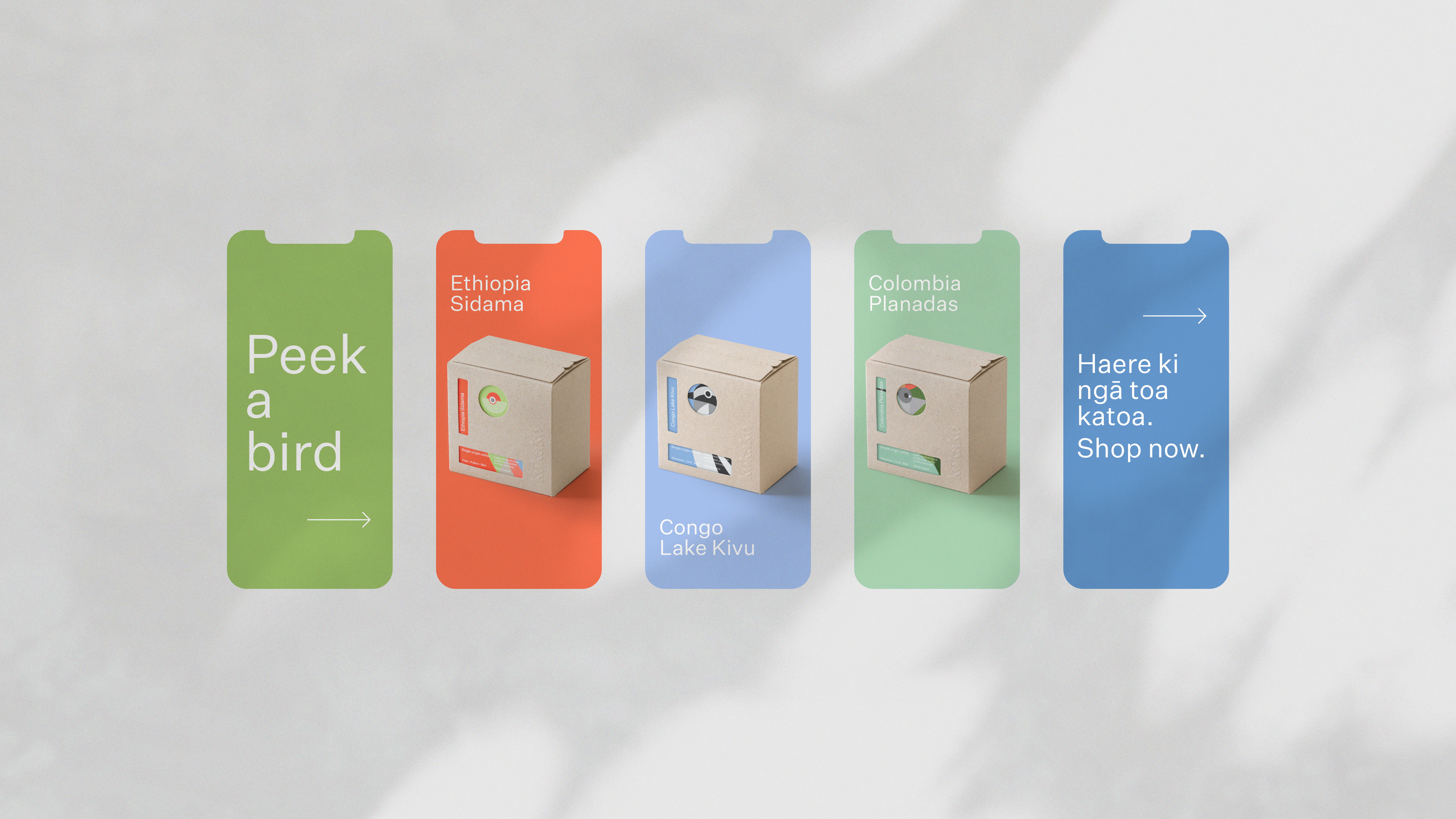
Design Dairy’s approach to Kokako Organic Coffee Roasters’ Single Origin Packaging updated the brand’s visual identity while addressing the practical challenges of shelf presence and transit functionality. The incorporation of a unique local bird illustration for each variant, presented in a punchy, block style, not only added a playful touch but also allowed each coffee to stand out. The final result is a blend of strength and whimsy, providing a bold solution that enables each variant to take flight while upholding Kokako’s commitment to sustainability and maintaining brand continuity.
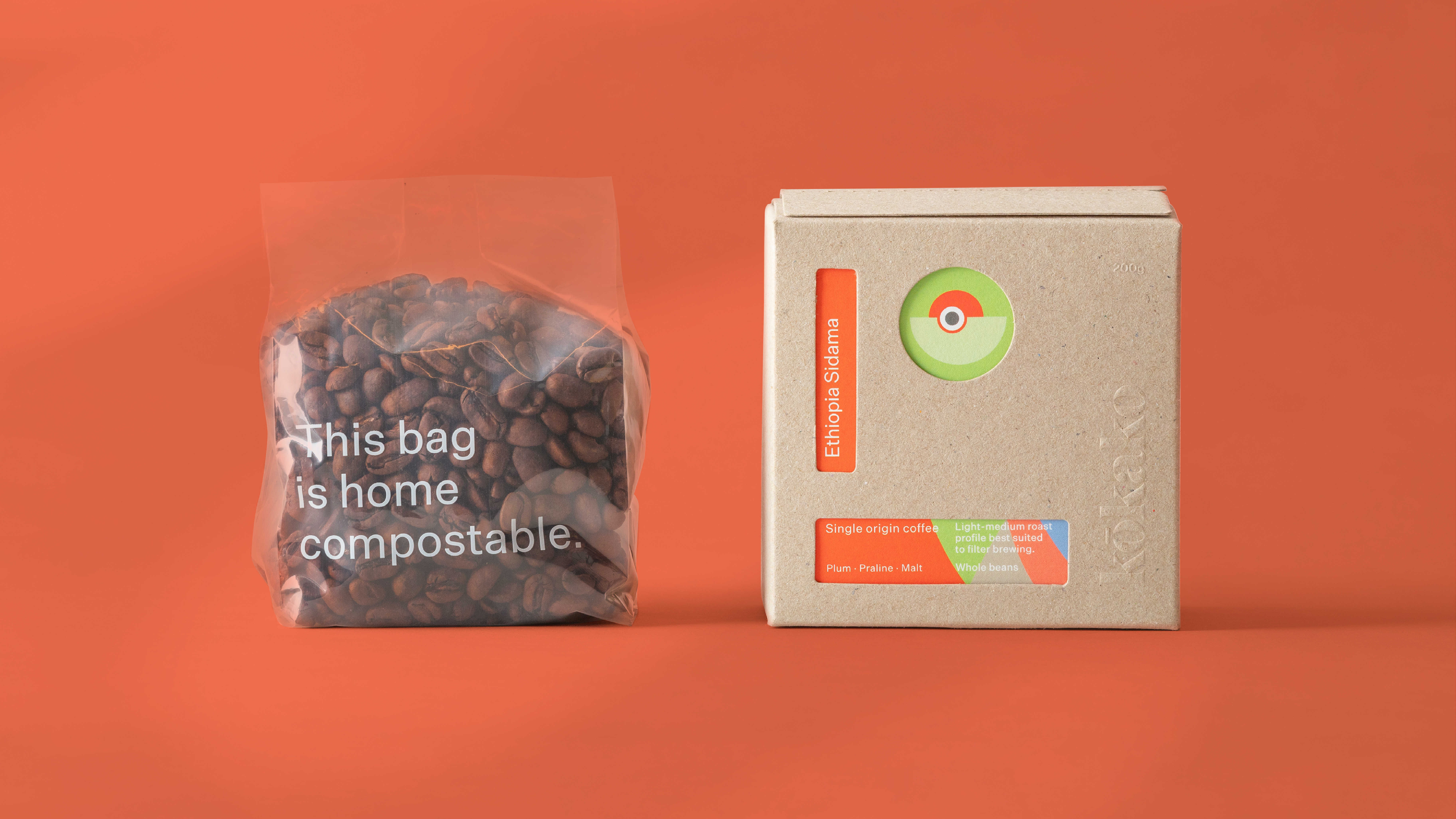
Kokako Organic Coffee Roasters approached us to come up with a packaging concept for their Single Origin range that could be used going forward as a universal pack that would serve to house any current and future short-run coffees. The challenge involved maintaining brand awareness, functionality of the pack on the shelf and in transit, as well as allowing each variant to display its own unique difference.
Because of the utilitarian need for the pack strength (physically and brand-wise) we created a box that could house any bird — a bird box. By designing a system where each variant would have its own local bird illustrated in our punchy, block style, we ensured consistency of the Kokako brand, all while allowing each to take flight on its own. The overall result was a strong, bold, and playful solution that allowed each variant to spread its wings — all while maintaining good brand continuity and staying true to Kokako’s continued commitment to sustainability.
