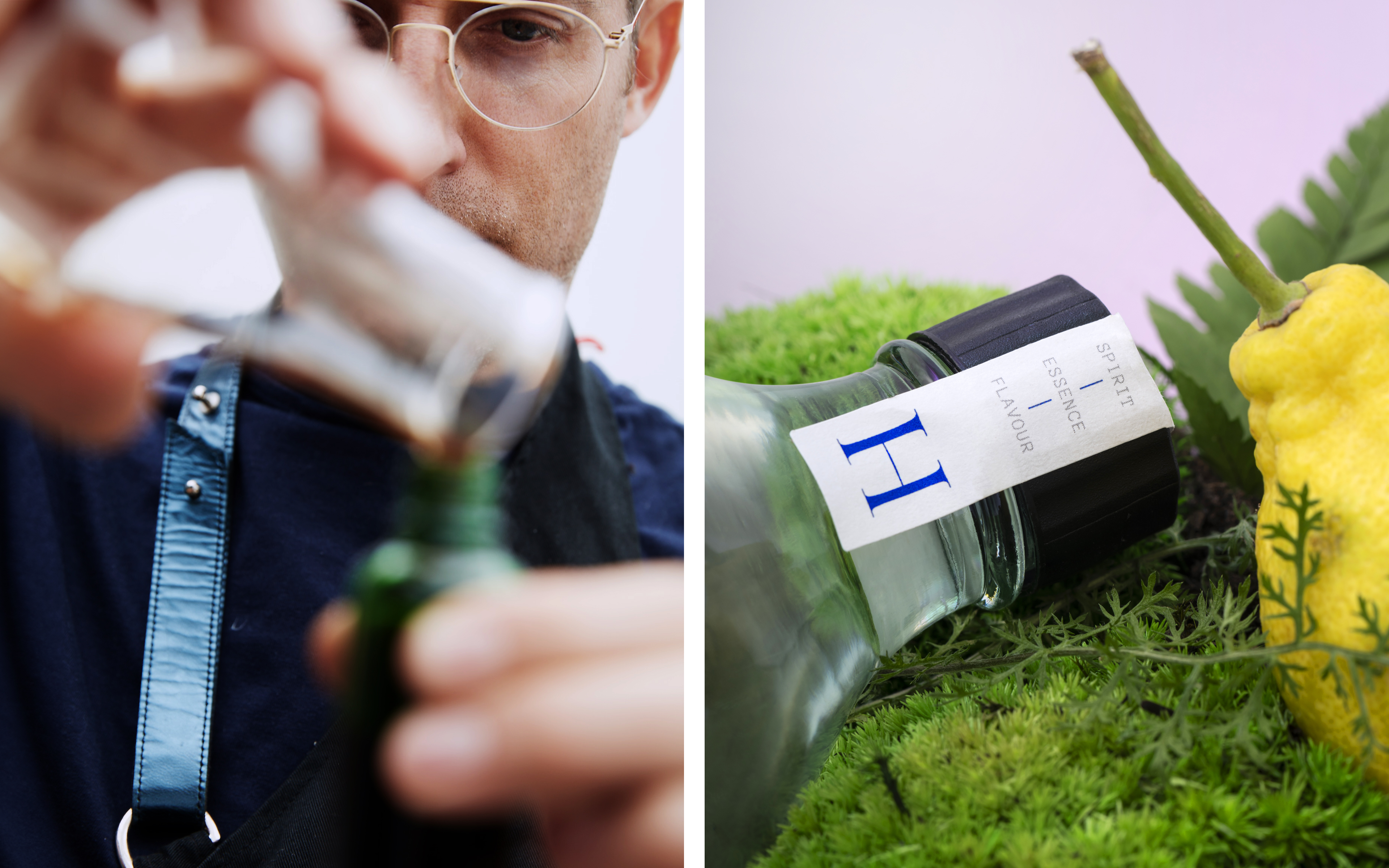
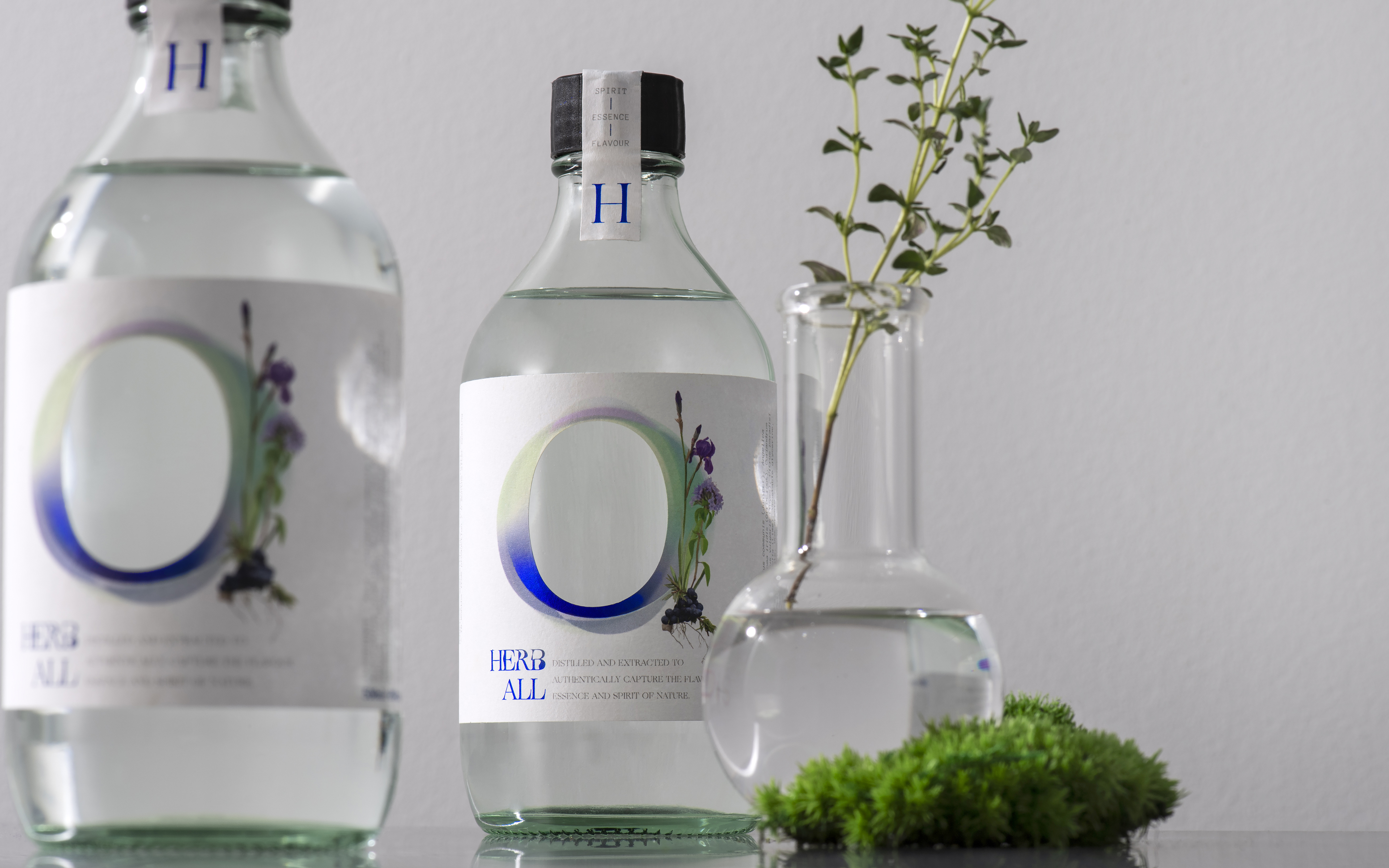
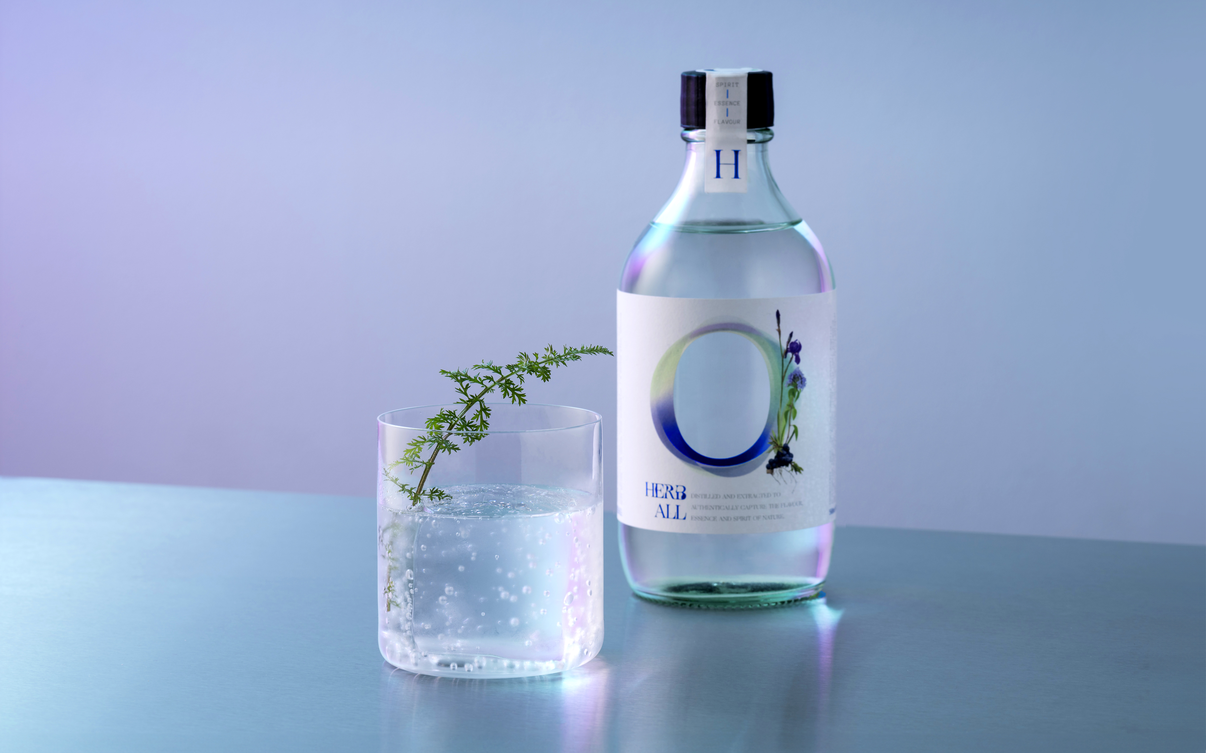
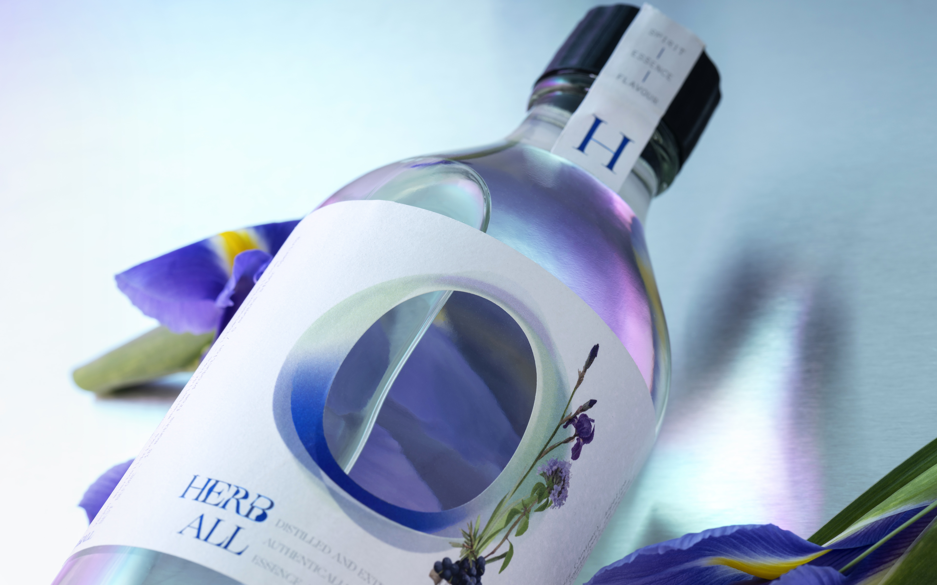
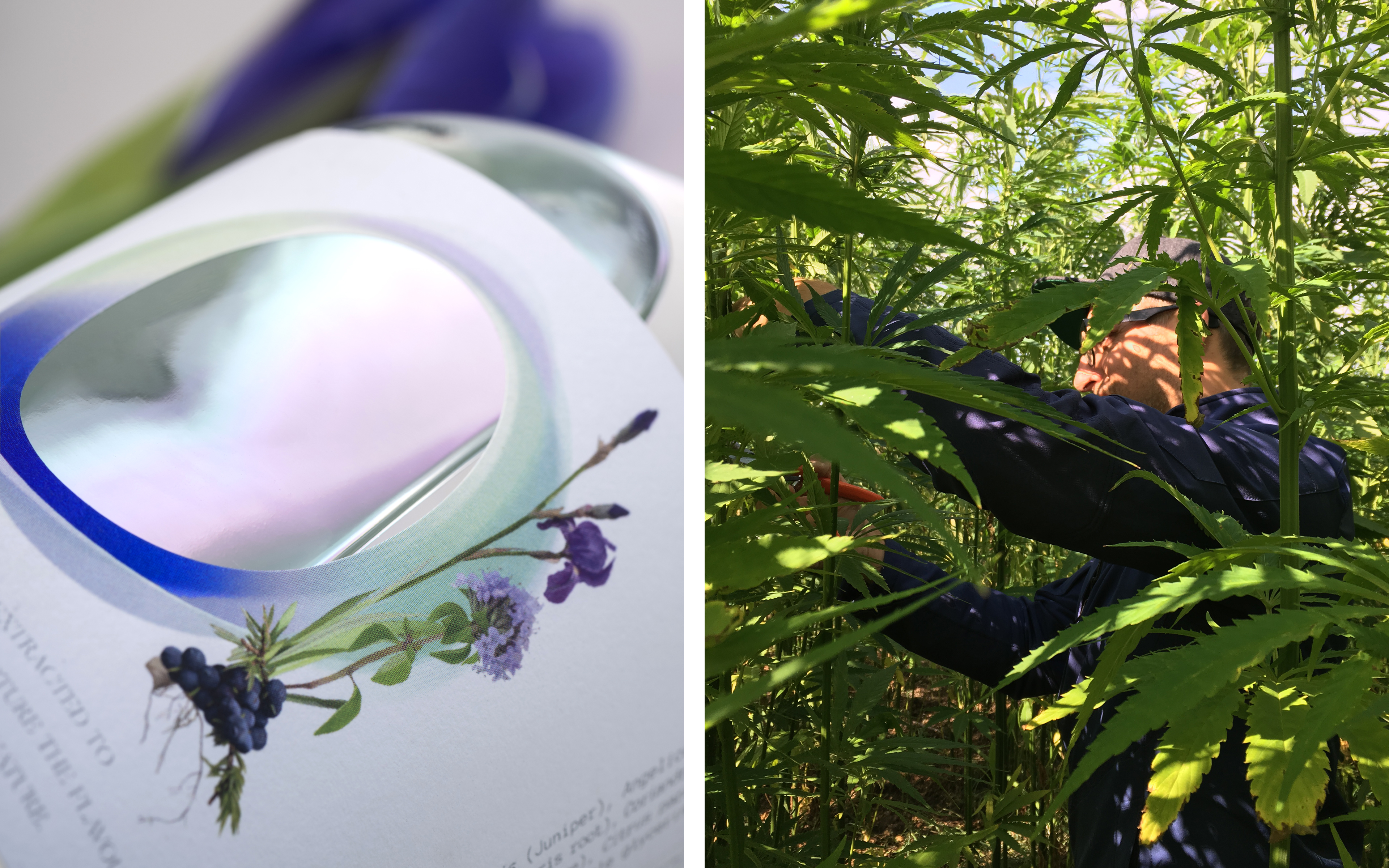
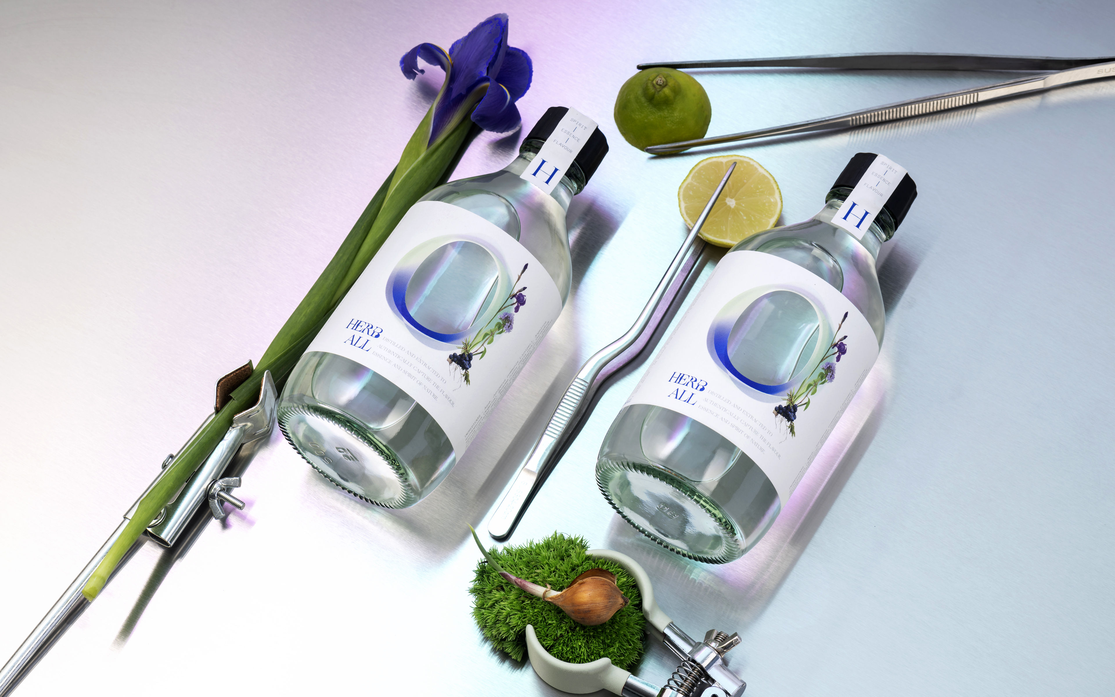
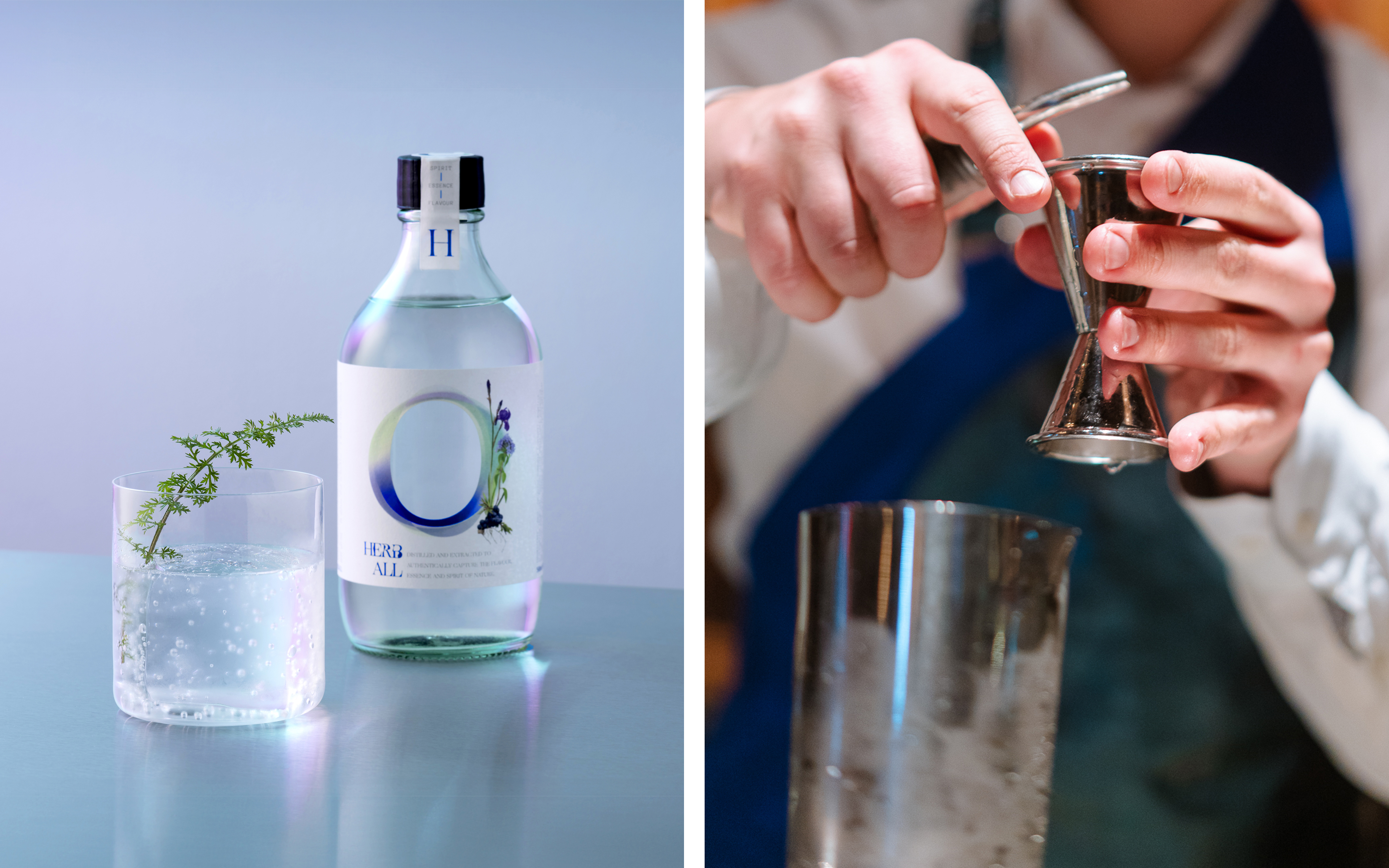
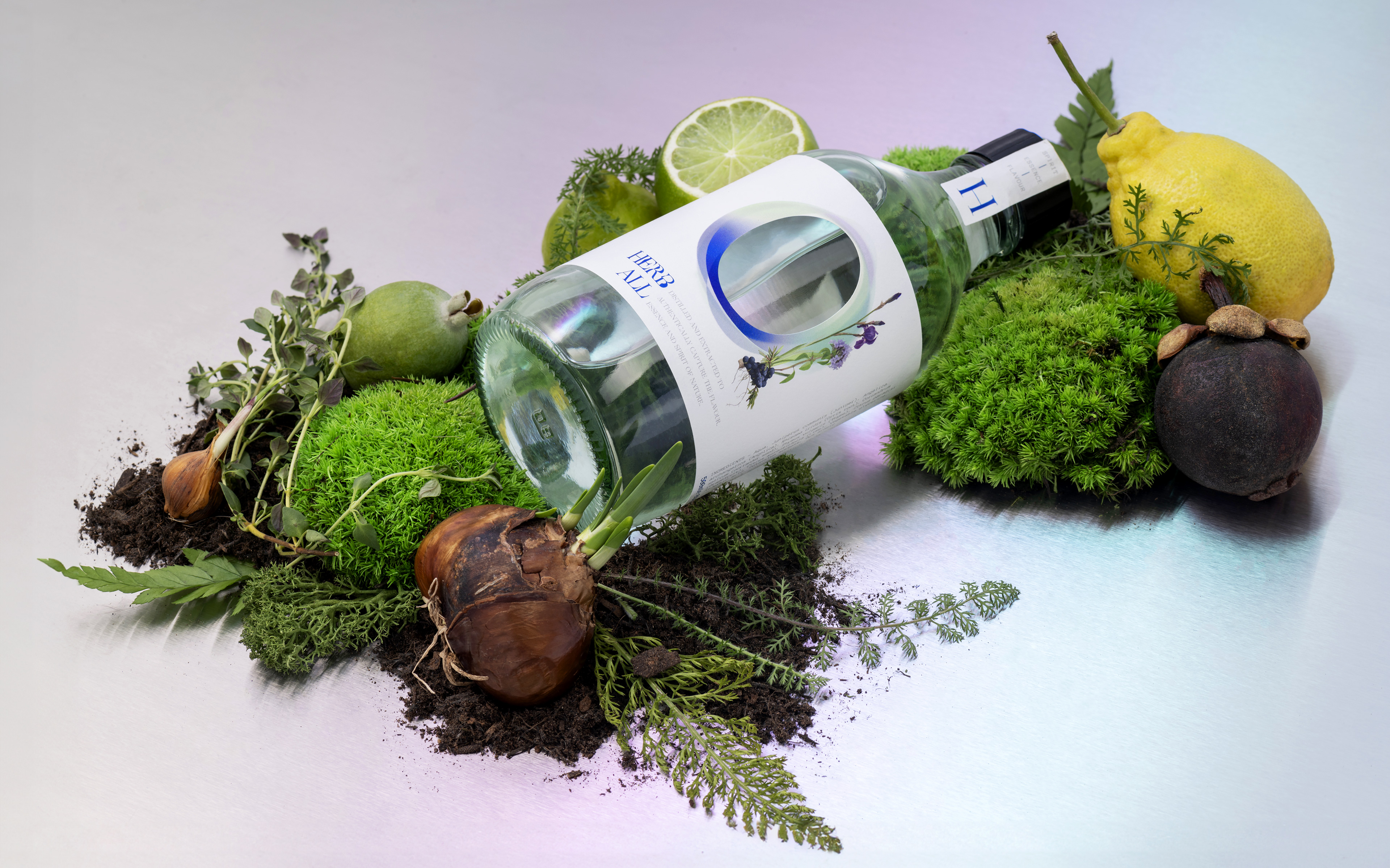
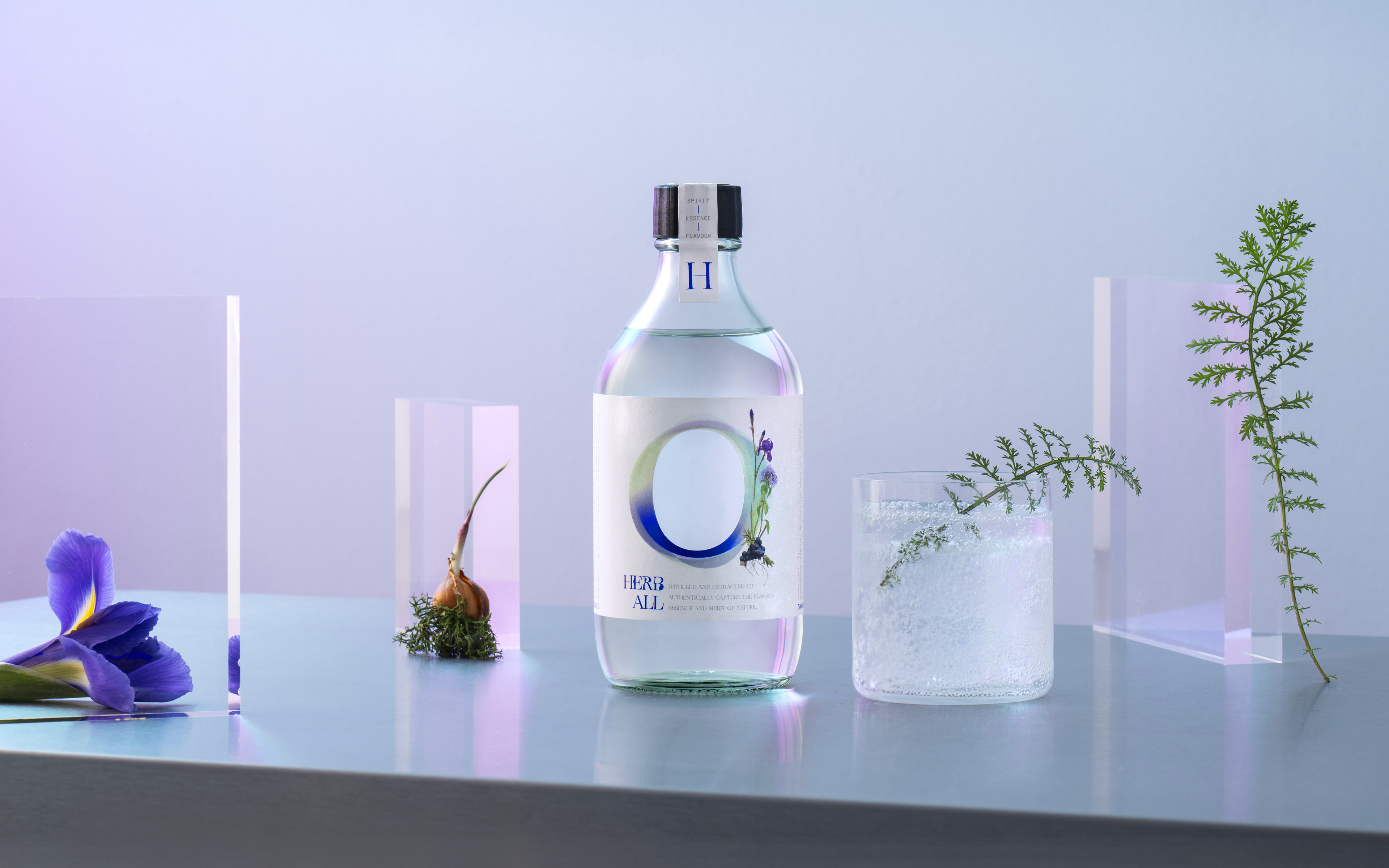
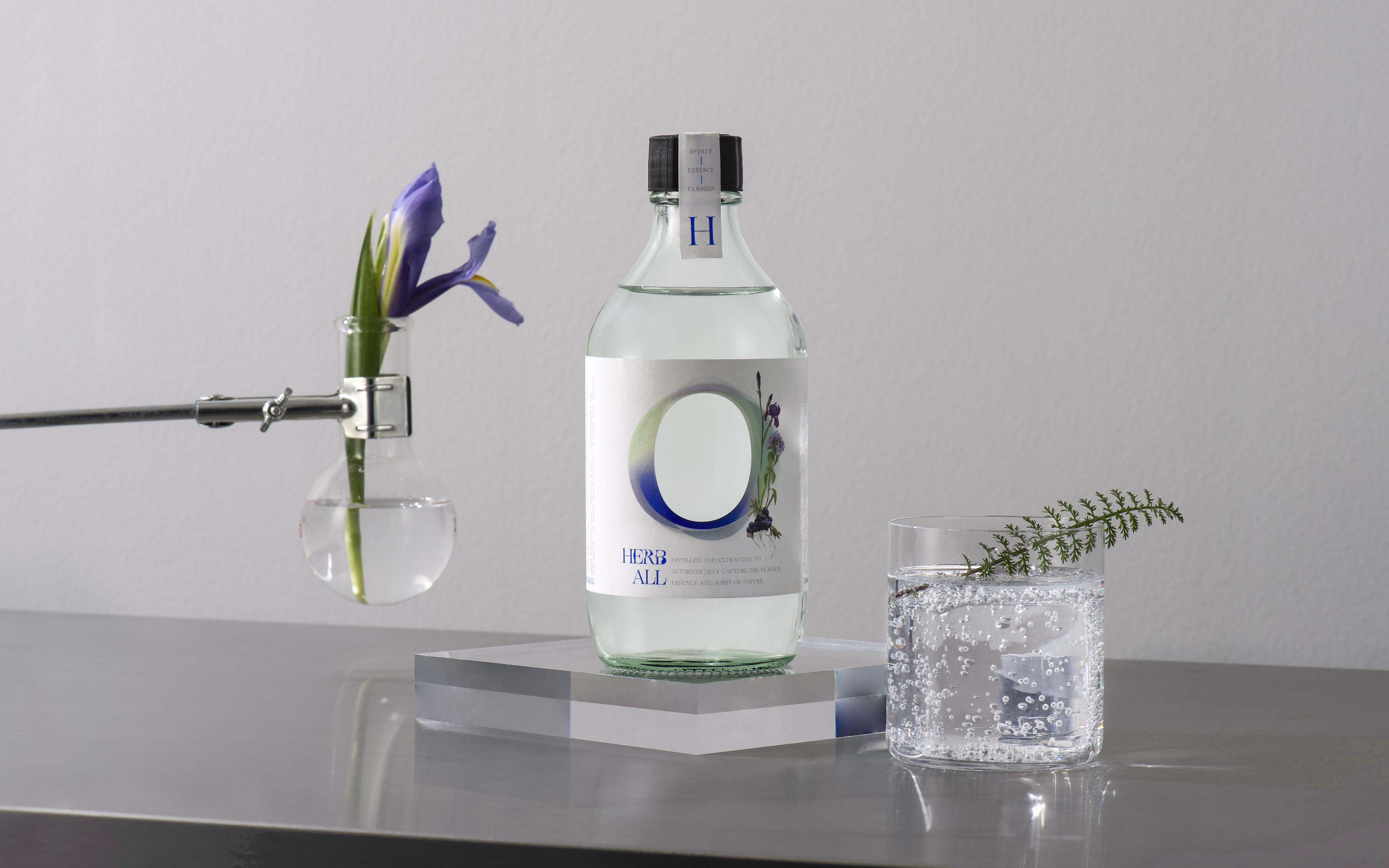
Mid-air Studio’s packaging design for Herb All reflects a harmonious fusion of science and nature. Inspired by the concept of a plant ‘portal,’ the central die-cut on the label invites consumers to immerse themselves in the botanical extracts’ unique flavors, essence, spirit, and energies. The deliberate minimalism and simplicity of the bottle and label elements highlight the ingredients’ scientific approach and purity. The restrained use of the brand’s intense ultramarine blue adds a visual contrast, symbolizing the spiritual reverence for the natural world that defines Herb All’s philosophy.
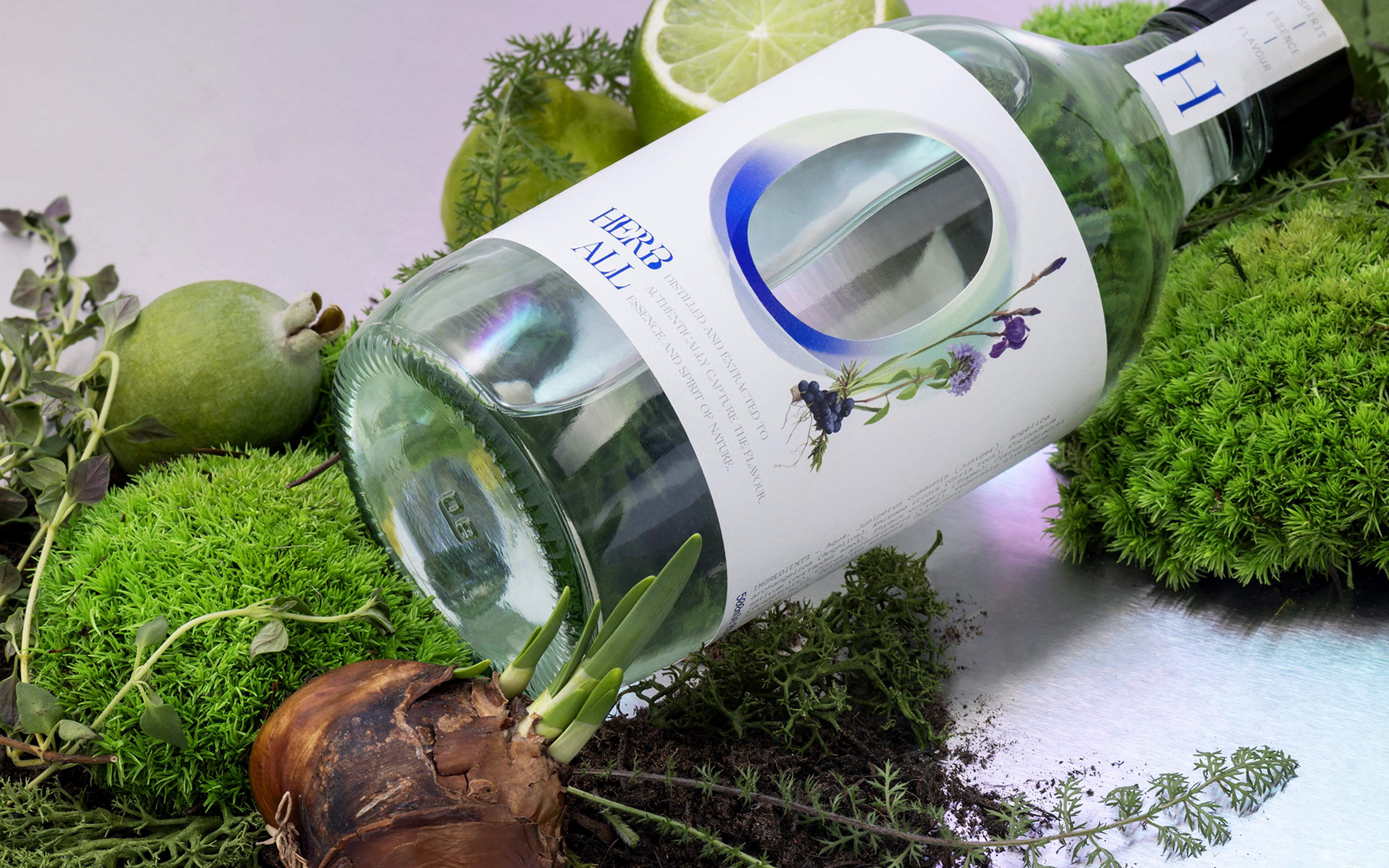
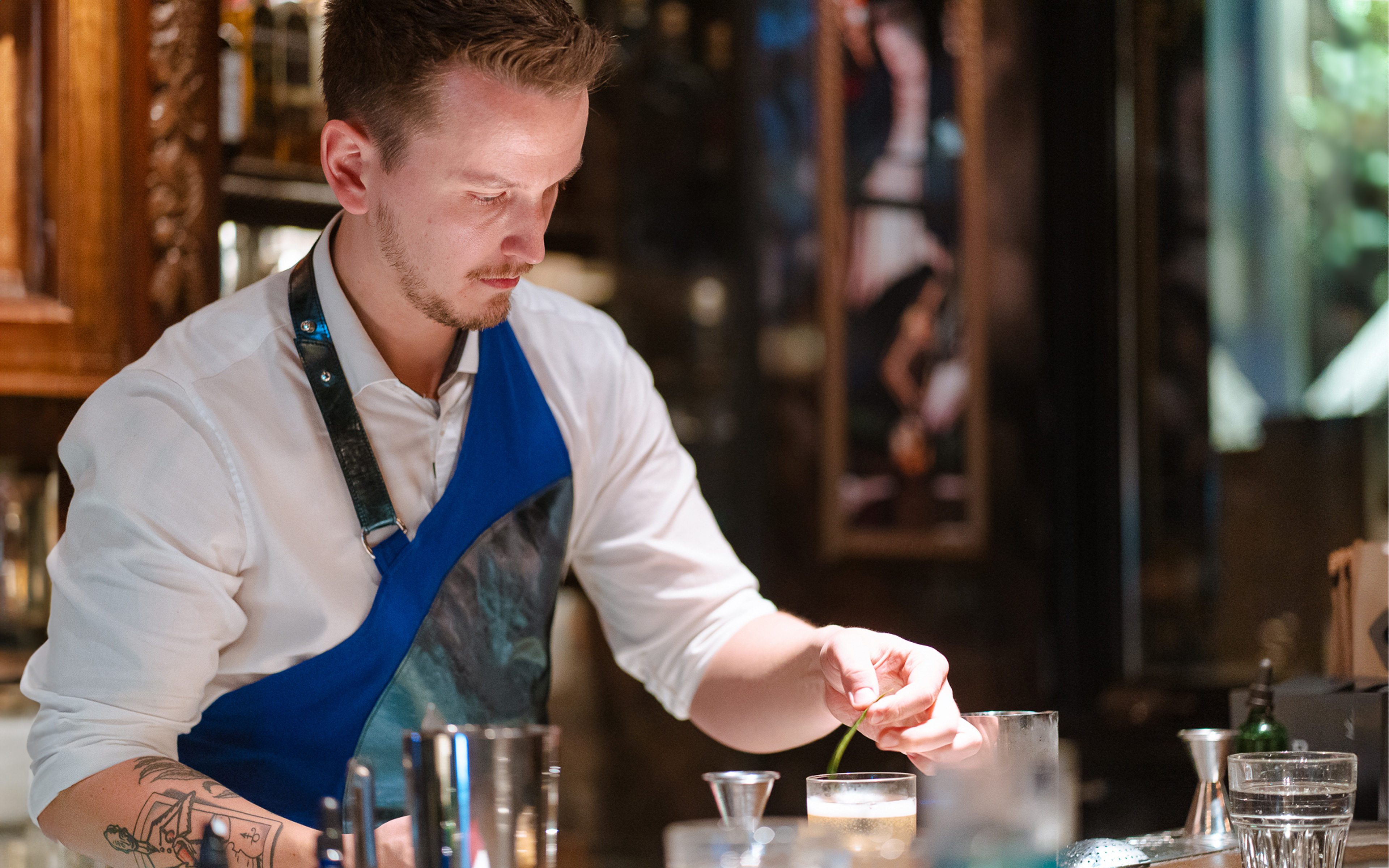
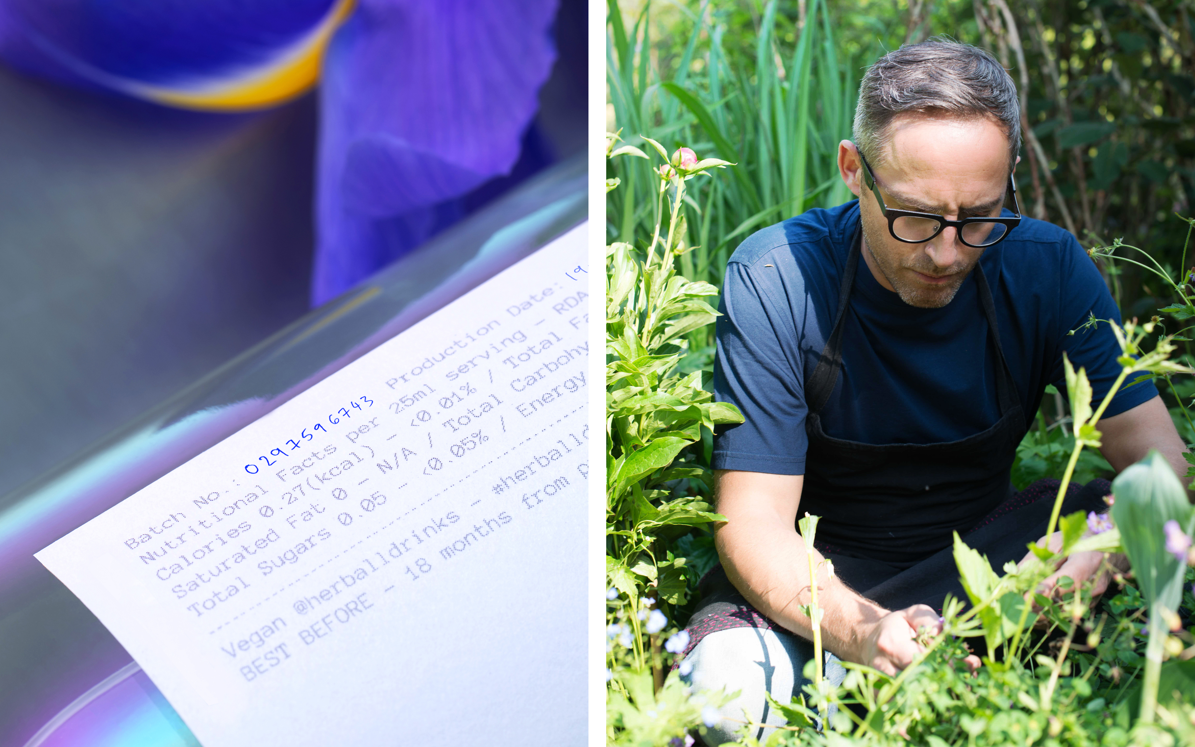
H E R B A L L – Brand creation + Packaging design Herb All is a unique new plant -based spirit conceived and formulated by the expert team at The Herball. Led by Michael Isted and Maxim Shulte, herbalist and mixologist respectively, The Herball is dedicated to respectfully and authentically integrating plants into beverages, cocktails and beyond. Their practice focuses on the creation of dynamic, nature-centric food and drink experiences, partnering with innovative organisations around the world. This is the first signature drinks offering under their own brand umbrella.
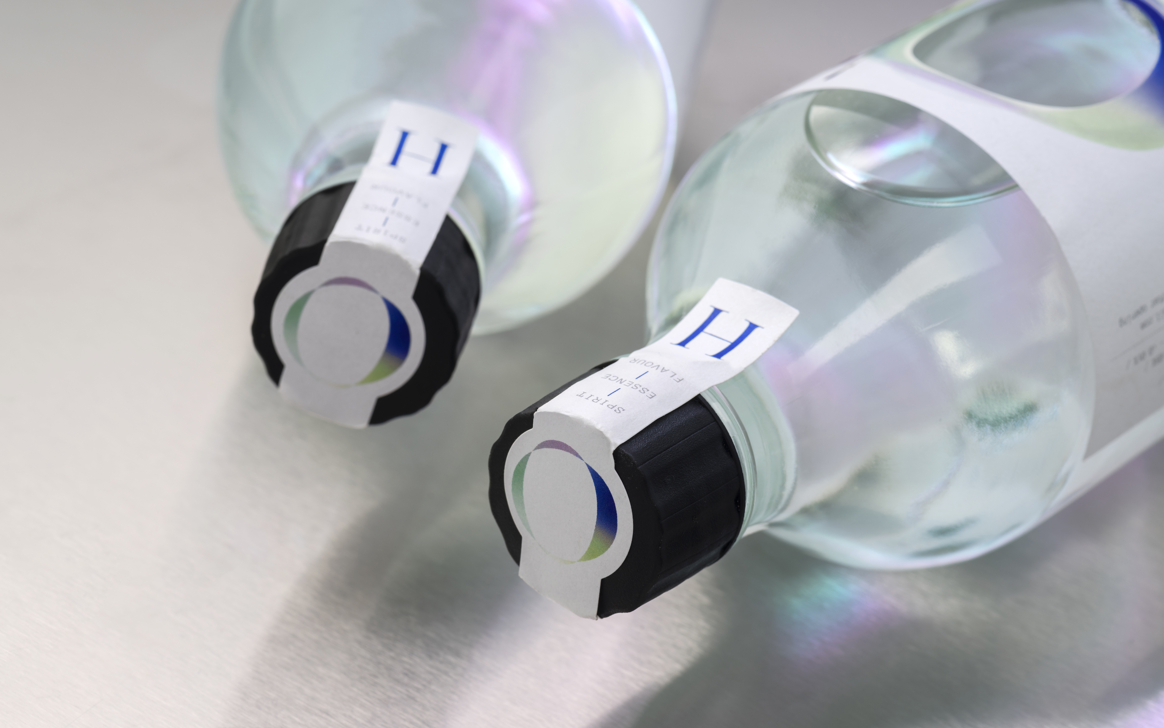
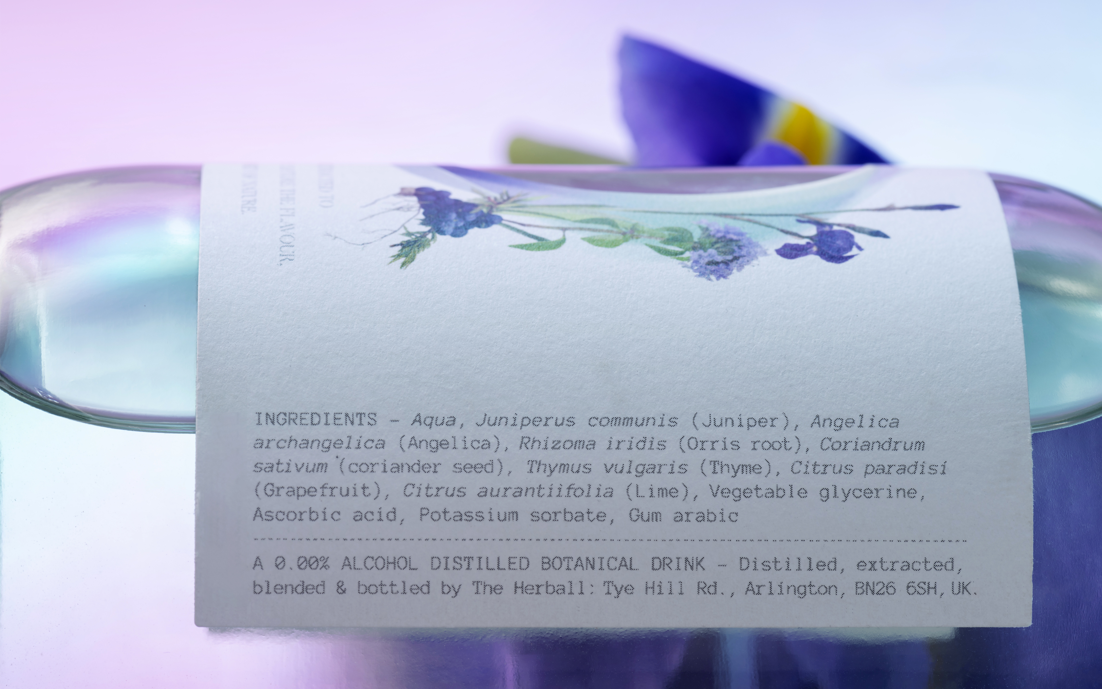
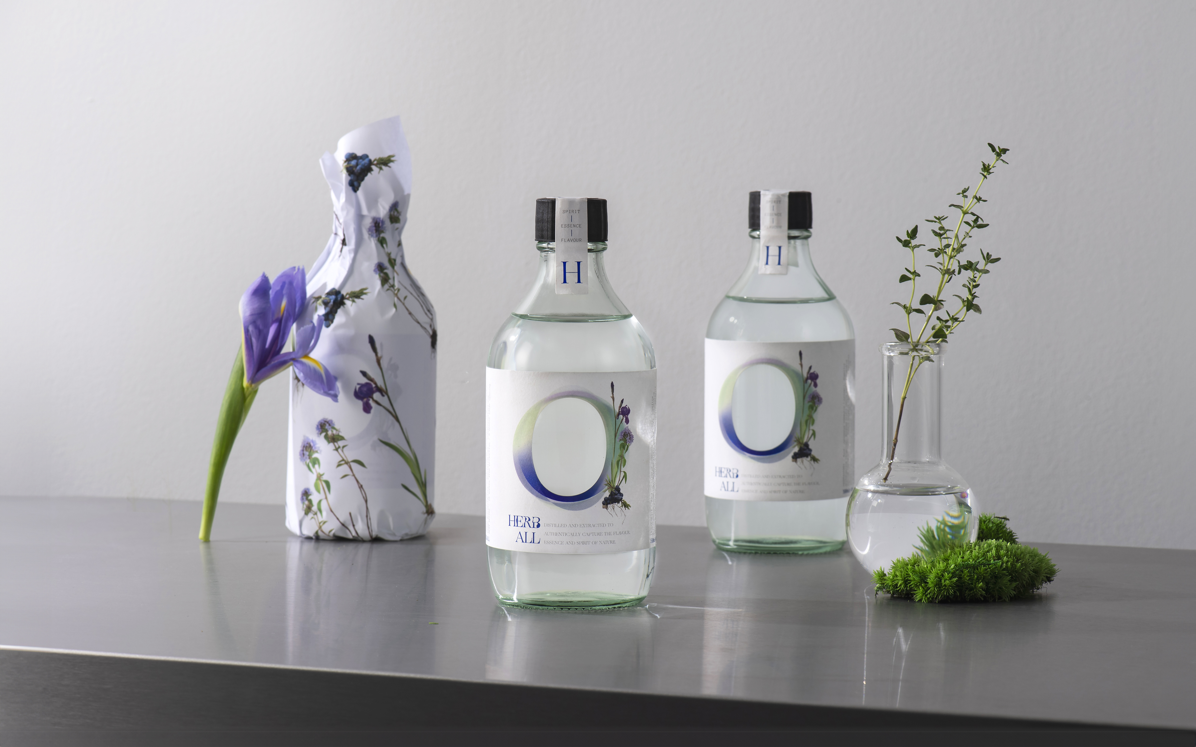
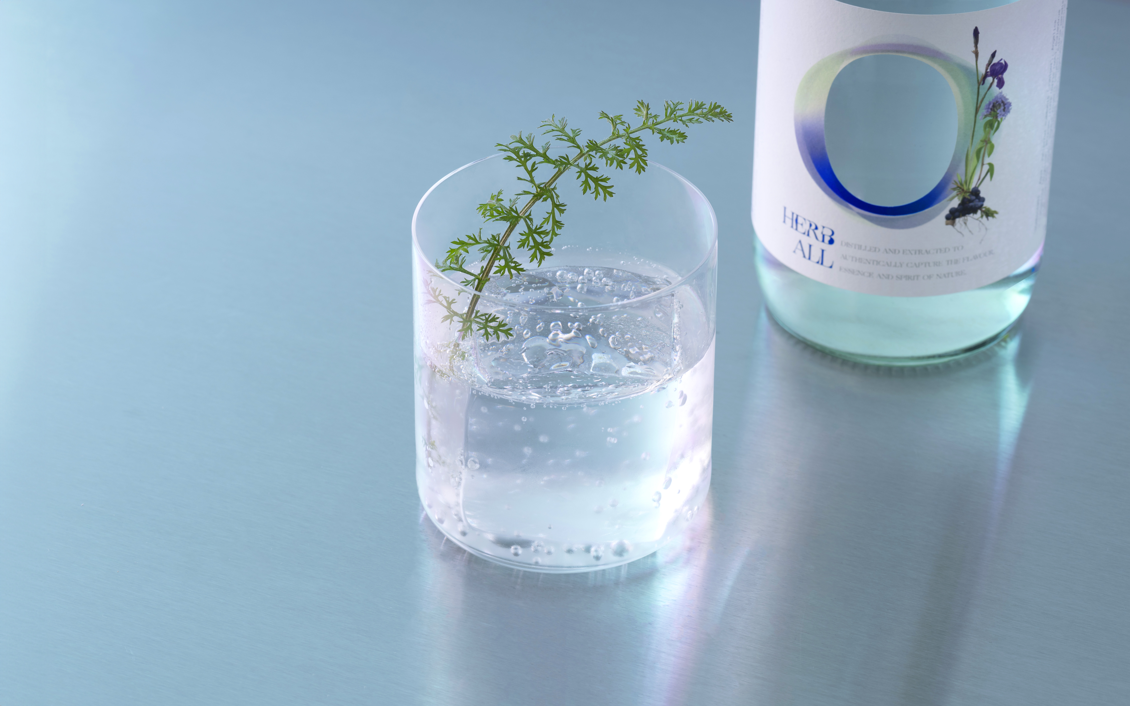
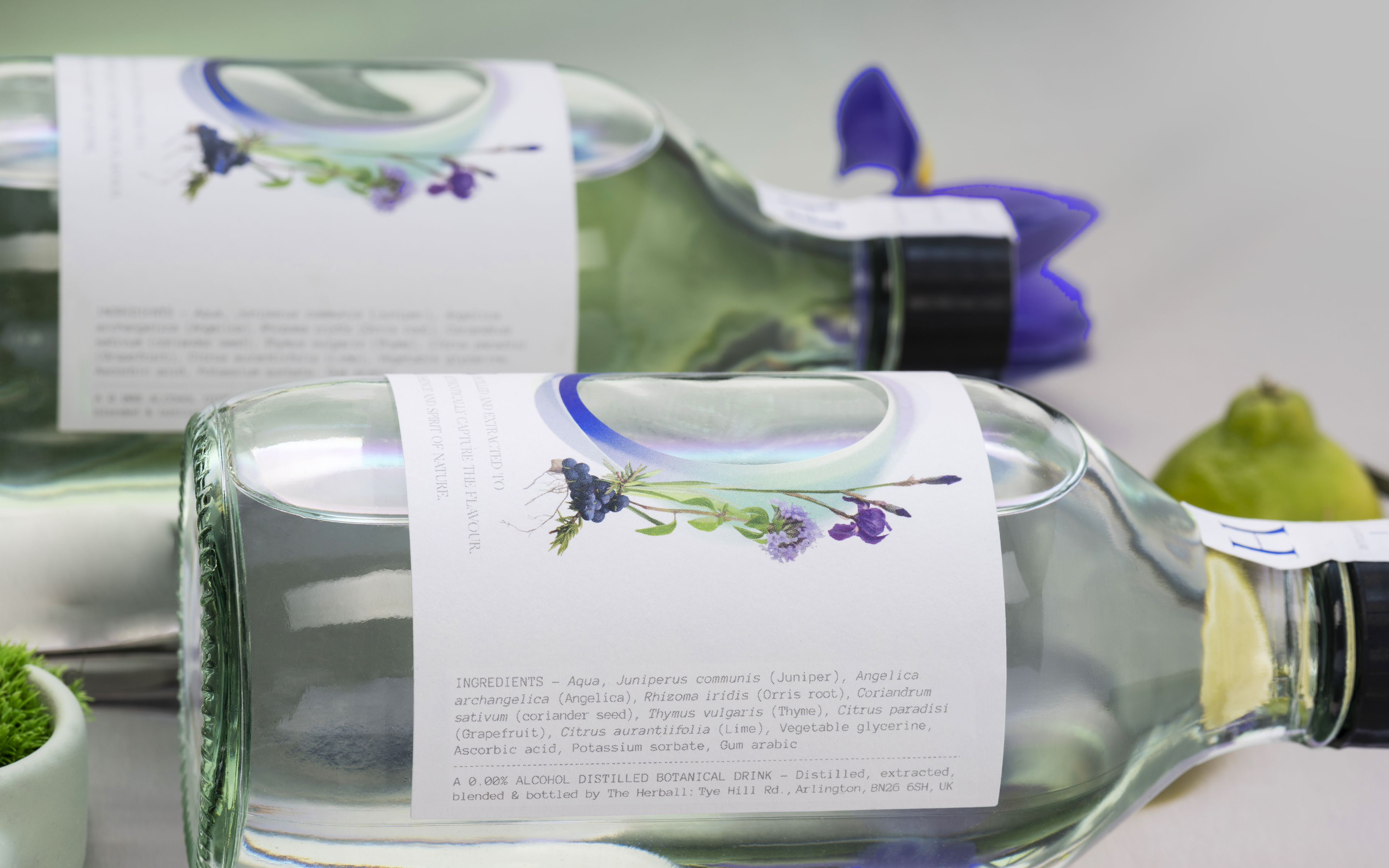
The drink is a 0% abv pure distillation of plant extracts including juniper, thyme, orris root, pink grapefruit and lemon which may be served with soda or tonic in the style of a gin. Building on some established parent brand assets, the label design leads with a physical interpretation of the brand’s O motif in the central die-cut. This represents the concept of a plant ‘portal’ through which we can truly experience their unique flavours, essence, spirit and energies. The tone and feel of the bottle and label elements are deliberately minimal, clean and simple to represent the science in the approach and the purity of the ingredients. This is softened and elevated with natural plant cues through use of signature ingredient illustrations.
This is punctuated by a controlled application of the brand’s intense ultramarine blue which serves as an unexpected visual counterpoint to the pared back, natural visual elements. An expression of the almost spiritual reverence for the natural world that underpins The Herball’s philosophy and their approach to the drink’s formulation. The simple bottle is hand labelled, numbered & wrapped in tissue paper featuring the ingredient illustrations.
