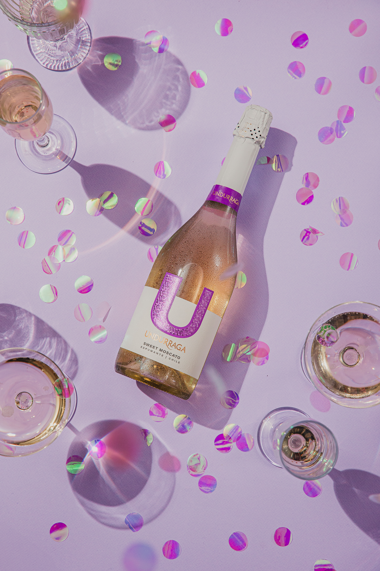
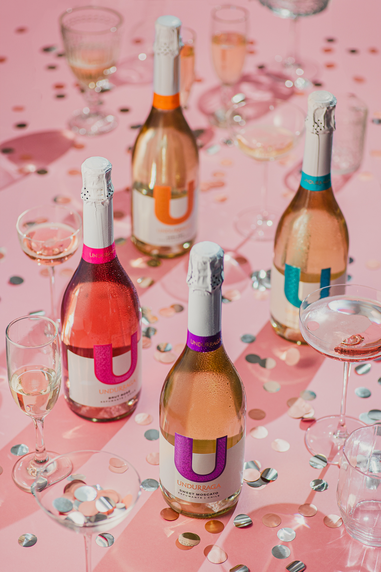
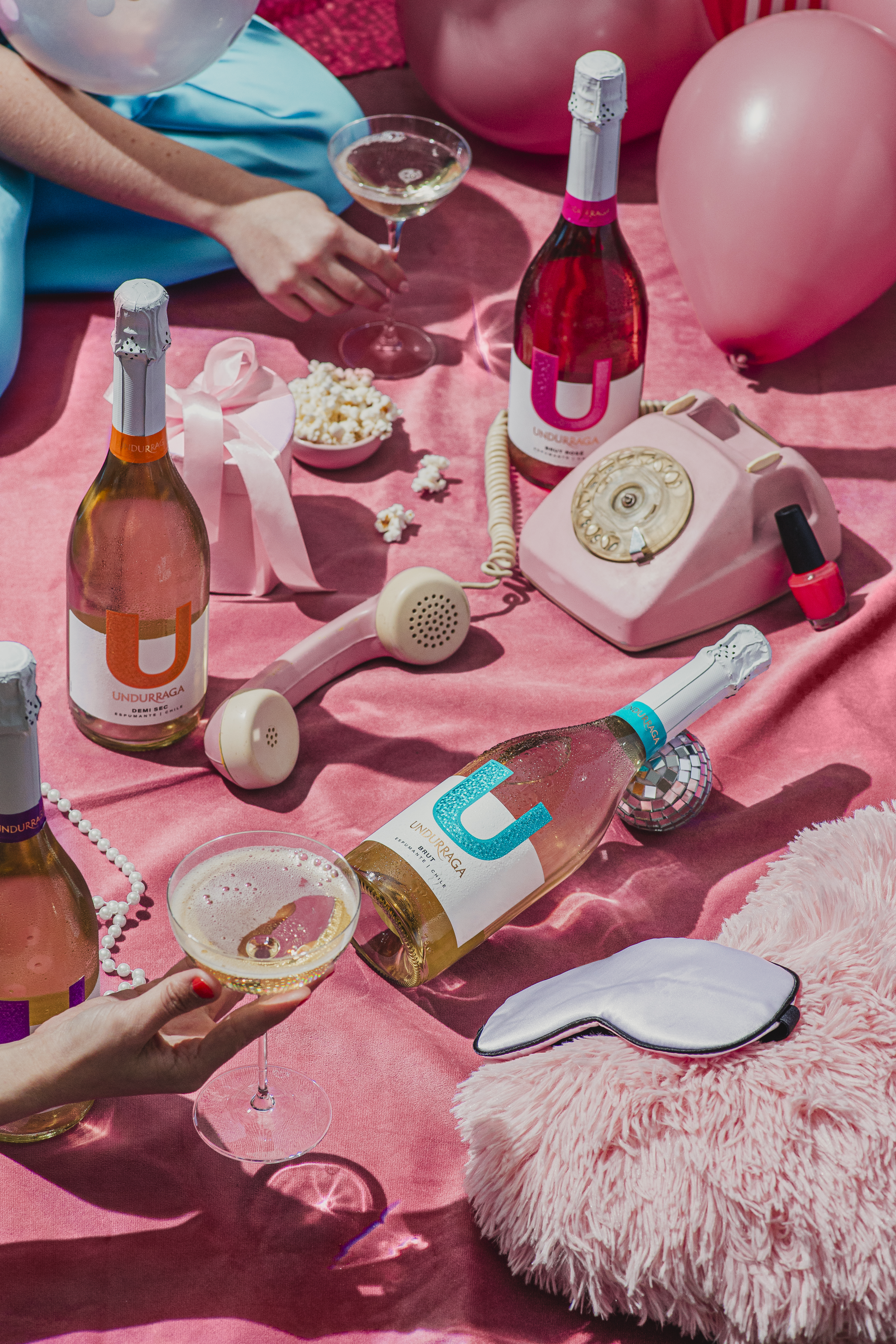
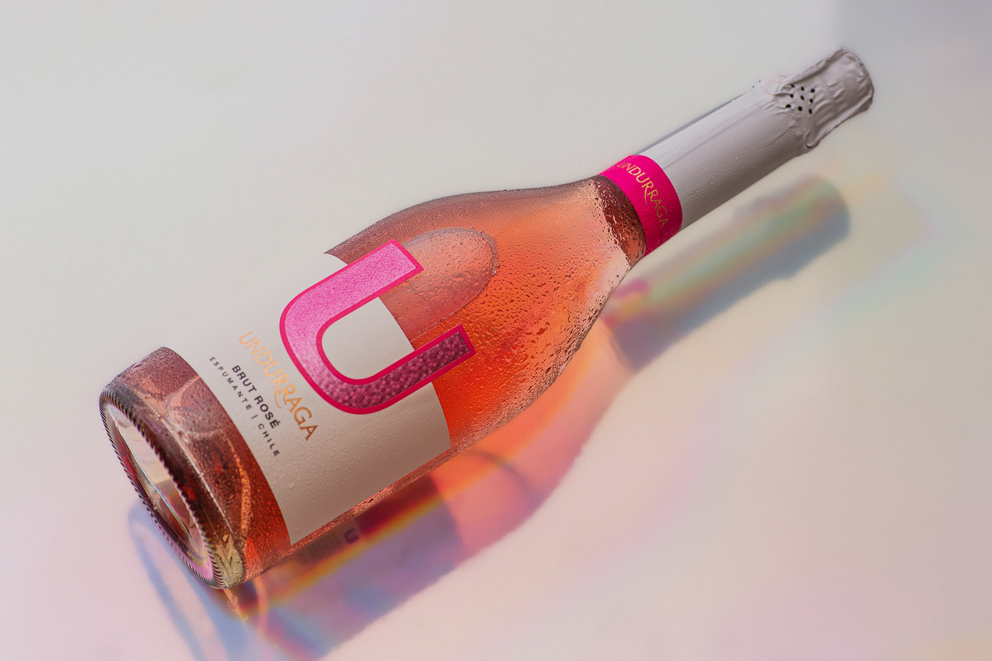
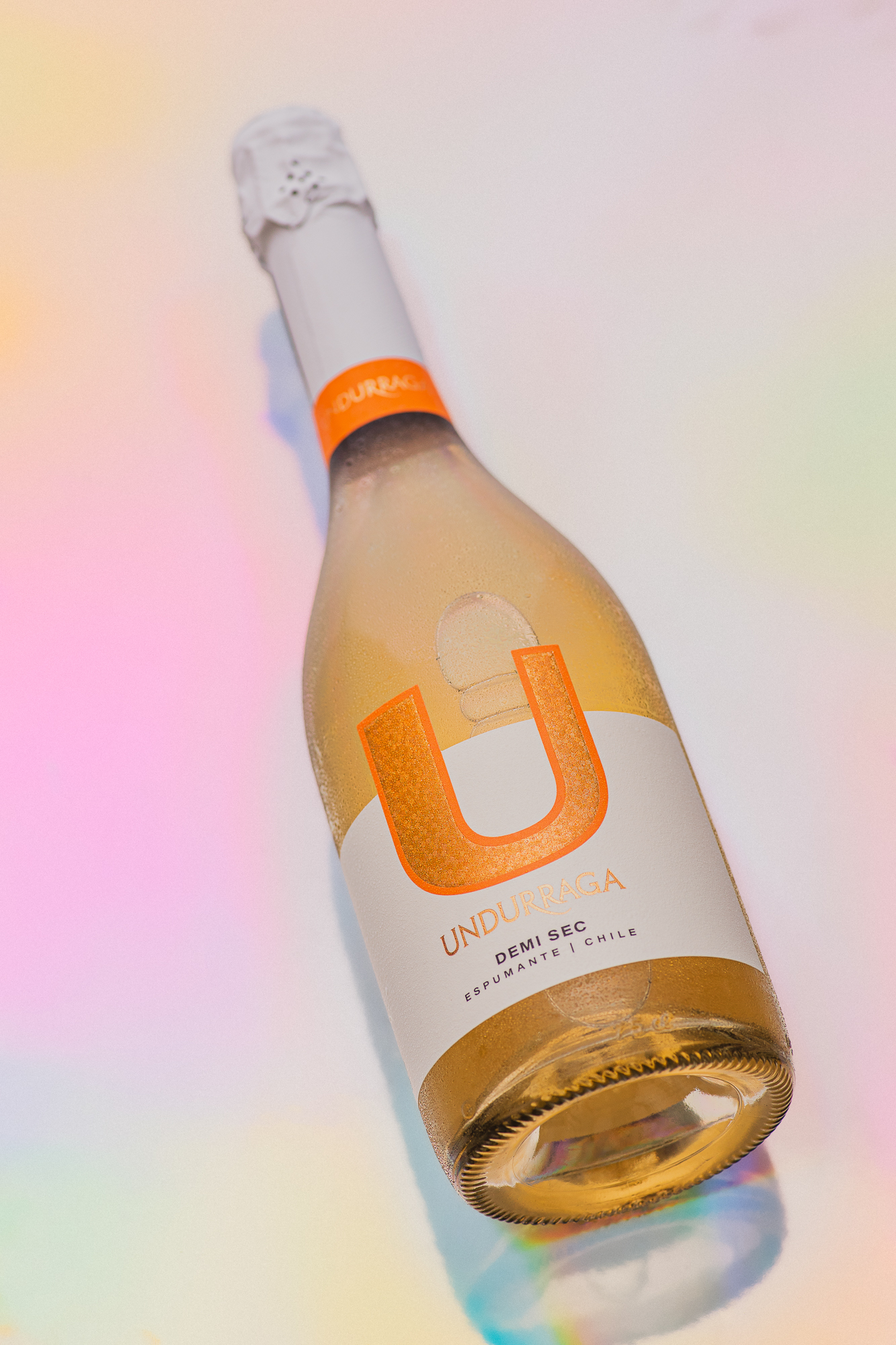
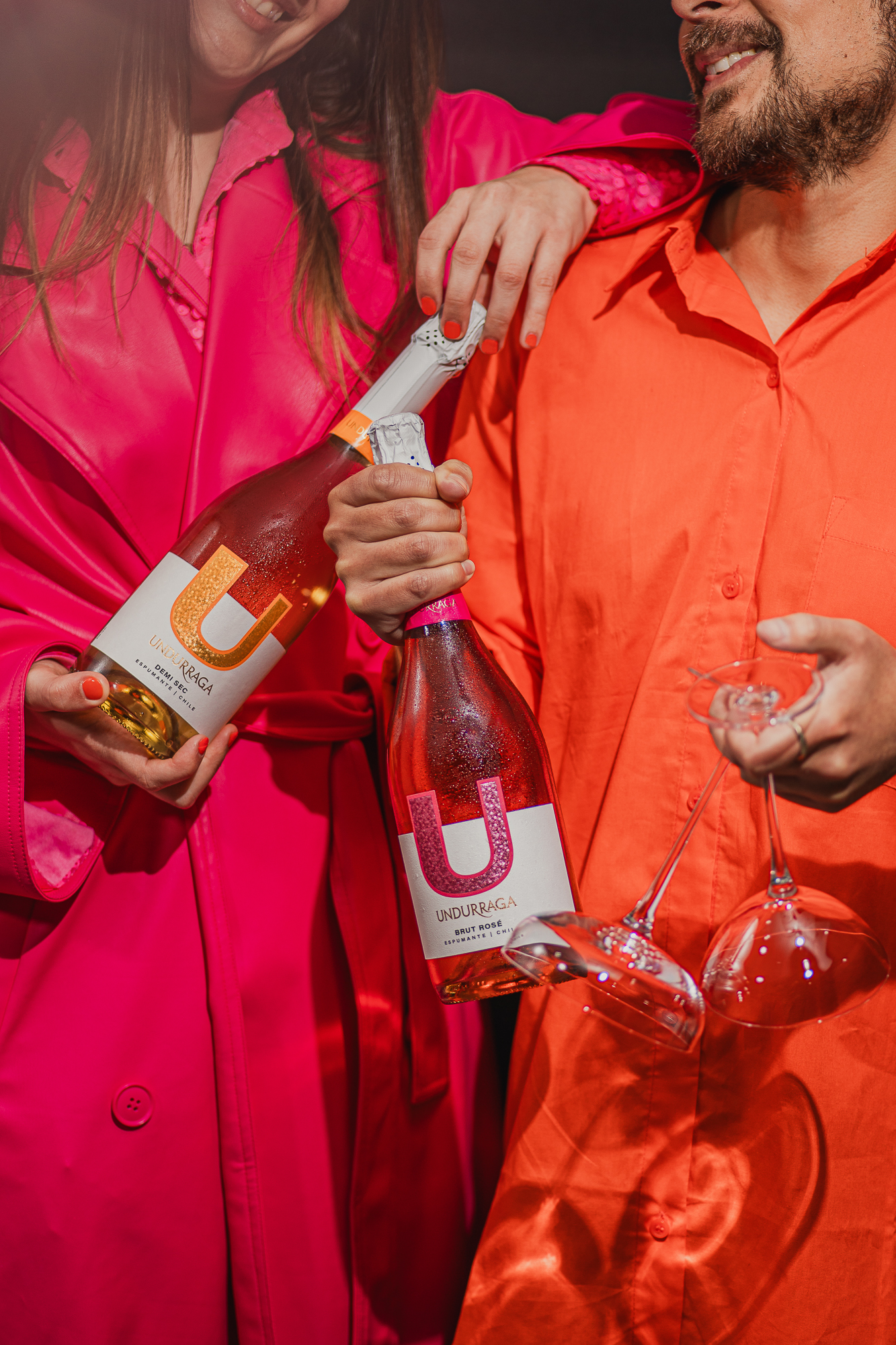
Nano Alfonsin Studio’s packaging design for U Sparkling by Viña Undurraga is a blend of stunning elements. The playful colors, coupled with a sophisticated type system, create a vibrant yet elegant visual appeal. The innovative use of die-cutting techniques and the incorporation of the brand’s iconic logo contribute to a label that not only stands out but also exudes a modern and fresh essence. Through meticulous details like micro embossing and overprinting on the foil, the packaging successfully captures the joyous spirit of the sparkling wine, ensuring a balanced and visually striking presentation.
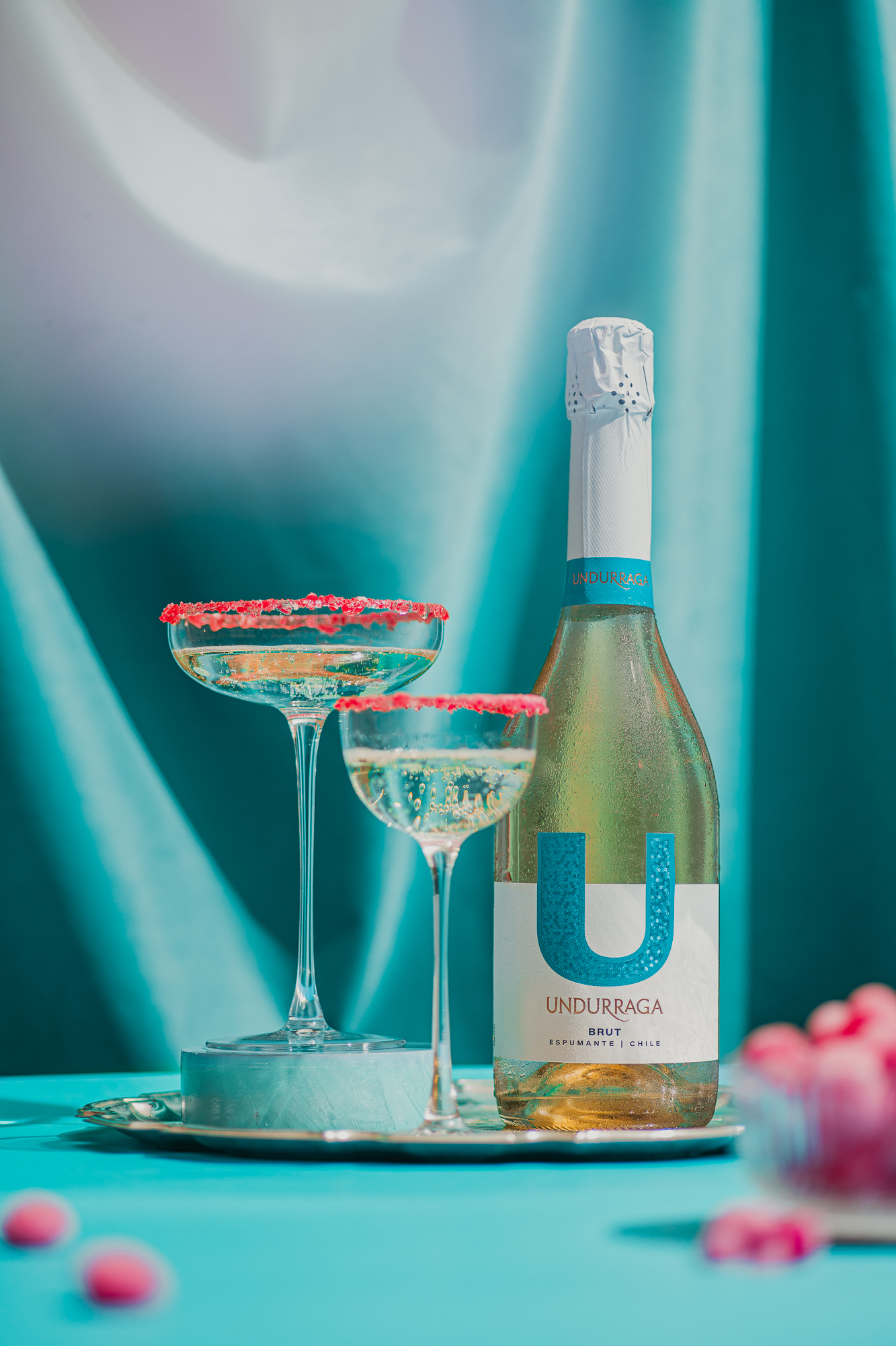
Eye-catching, juvenile, refined,… We present to you this new project from Viña Undurraga. We’ve played with die-cutting and the iconic logo that characterizes the brand. Through the use of attractive colors, innovative micro embossing, and overprinting on the foil, we have crafted a label that showcases the modern and fresh essence of this beverage, conveying the joy that this sparkling wine brings with it. Cheers!
